I’m starting out with Hype, and I don’t know much HTML5. I can’t seem to figure out how to create a radial gradient. I see that I can use a gradient fill for an element background, but that’s a linear gradient. Any help would be appreciated! Thanks!
It seems that Hype only does linear gradients. SVG can be used as an alternative.
But with a little creativity, it is possible to create something of a diamond gradient with Hype.
diamond-gradient.hypetemplate.zip (18.2 KB)
Thanks Michael!
I thought that there would be a simple way using the “Edit Element’s Inner HTML” but I’m not too familiar with that quite yet.
Thanks again!
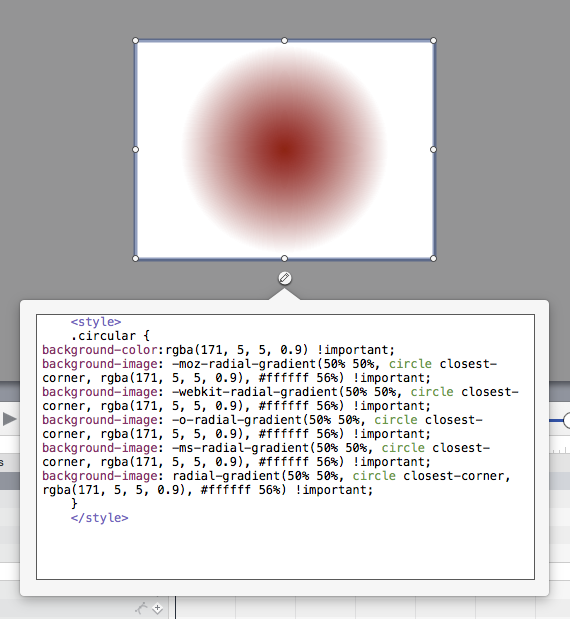
Step1:
[Get the code][1] , You can create several effects.
Example:
background-color:rgba(171, 5, 5, 0.9);
background-image: -moz-radial-gradient(50% 50%, circle closest-corner, rgba(171, 5, 5, 0.9), #ffffff 56%);
background-image: -webkit-radial-gradient(50% 50%, circle closest-corner, rgba(171, 5, 5, 0.9), #ffffff 56%);
background-image: -o-radial-gradient(50% 50%, circle closest-corner, rgba(171, 5, 5, 0.9), #ffffff 56%);
background-image: -ms-radial-gradient(50% 50%, circle closest-corner, rgba(171, 5, 5, 0.9), #ffffff 56%);
background-image: radial-gradient(50% 50%, circle closest-corner, rgba(171, 5, 5, 0.9), #ffffff 56%)
Step 2:
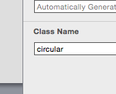
make a class called .circular and add the code
<style>
.circular { ...... code here....... }
</style>
Step 3:
add " !important " at the end of each line. ( force the original styles made by hype )
    <style>
    .circular {
background-color:rgba(171, 5, 5, 0.9) !important;
background-image: -moz-radial-gradient(50% 50%, circle closest-corner, rgba(171, 5, 5, 0.9), #ffffff 56%) !important;
background-image: -webkit-radial-gradient(50% 50%, circle closest-corner, rgba(171, 5, 5, 0.9), #ffffff 56%) !important;
background-image: -o-radial-gradient(50% 50%, circle closest-corner, rgba(171, 5, 5, 0.9), #ffffff 56%) !important;
background-image: -ms-radial-gradient(50% 50%, circle closest-corner, rgba(171, 5, 5, 0.9), #ffffff 56%) !important;
background-image: radial-gradient(50% 50%, circle closest-corner, rgba(171, 5, 5, 0.9), #ffffff 56%) !important;
    }
    </style>
Step 4:
in Hyde create a text box
add the class “circular” to this box
Paste the code in the inter HTML (alt+cmd+e) of the Box
Download Template radial_gradient_example.hypetemplate.zip (116.3 KB)
hope this helps
Michelangelo
[1]: http://westciv.com/tools/radialgradients/index.html#background-image:%20radial-gradient(50%25%2050%25,%20circle
1 Like
Thanks for this @michelangelo,
If you put the code in or on an ellipse you can increase the , #ffffff 56%) !important; part 100%
i.e
	    <style>
    .circularInRect {
background-color:rgba(171, 5, 5, 0.9) !important;
background-image: -moz-radial-gradient(50% 50%, circle closest-corner, rgba(171, 5, 5, 0.9), #ffffff 56%) !important;
background-image: -webkit-radial-gradient(50% 50%, circle closest-corner, rgba(171, 5, 5, 0.9), #ffffff 56%) !important;
background-image: -o-radial-gradient(50% 50%, circle closest-corner, rgba(171, 5, 5, 0.9), #ffffff 56%) !important;
background-image: -ms-radial-gradient(50% 50%, circle closest-corner, rgba(171, 5, 5, 0.9), #ffffff 56%) !important;
background-image: radial-gradient(50% 50%, circle closest-corner, rgba(171, 5, 5, 0.9), #ffffff 56%) !important;
    }
    </style>


        <style>
    .circularInEllipse {
background-color:rgba(171, 5, 5, 0.9) !important;
background-image: -moz-radial-gradient(50% 50%, circle closest-corner, rgba(171, 5, 5, 0.9), #ffffff 100%) !important;
background-image: -webkit-radial-gradient(50% 50%, circle closest-corner, rgba(171, 5, 5, 0.9), #ffffff 100%) !important;
background-image: -o-radial-gradient(50% 50%, circle closest-corner, rgba(171, 5, 5, 0.9), #ffffff 100%) !important;
background-image: -ms-radial-gradient(50% 50%, circle closest-corner, rgba(171, 5, 5, 0.9), #ffffff 100%) !important;
background-image: radial-gradient(50% 50%, circle closest-corner, rgba(171, 5, 5, 0.9), #ffffff 100%) !important;
    }
</style>Thanks so much @michelangelo and @MarkHunte! This helps me not only with this question but also with my CSS/HTML.
Much appreciated!
Unfortunately you cannot animate this gradient ( made with code in the inter HTML) . I hope to see this option natively in Hype in future.
6 Years later… 
1 Like
…but look at how helpful I was. Heh, that's a nice diamond gradient.
I had forgotten that I made that. Nice! 