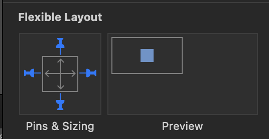
Since I am unable to figure out how to properly control all the breakpoints for responsive versions, I am wondering how I can get all the elements which I grouped together to always display in the exact center of the browser window, no matter whether on mobile, tablet, or desktop.
As it is, on taller screens, like the iPhone 13 Pro Max, what should be vertically centered appears in the top 2/3rd of the screen, and on older devices, in the lower 2/3rd, on some devices elements are even running off the screen at the bottom.
I know that the aspect-ratio of screens has a lot to do with it, but how do I get smooth responsive scaling/positioning of elements from one break-point to the next, and how do design for modern tablets like that iPad Pro M1, which actually show the desktop version of the responsive layouts?
Since I have too many questions about proper use of breakpoints and responsive layouts, I want to just get a simple solution working, until I understand responsive design better, so...
What settings do I need to change for a Group of elements to always be centered, vertically and horizontally?