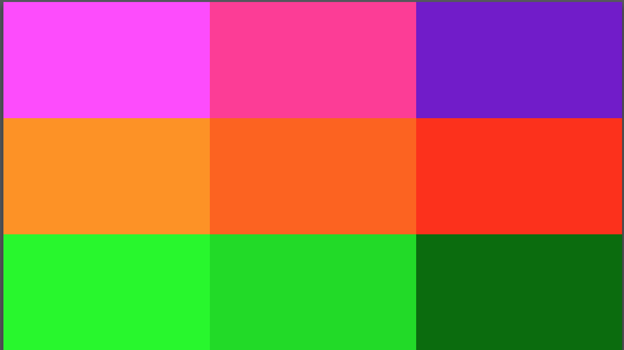
I have in mind an effect that I want to create without javascript, in order to create the effect, that will involve a photo moving in response to the position of the cursor on the page, I decided to try to do it with action areas or hotspots. In order for this to work as intended, I need to understand flexible layouts a little better. I was hoping that someone would be able to download the attached Hype file and fix the settings I have on the colored rectangles (and anywhere else in the document) so that no matter what size screen the page is viewed on, the rectangles will completely fill all available space. Please resize the page to the smallest possible size on your monitor to make sure the rectangles are acting correctly before reposting the file in a response. They should always be touching, never overlapping and never any space between them.
Ultimately, the opacity of the rectangles will be dropped to zero, making them areas of the page where a mouse over and mouse out action will trigger a timeline to play. The timelines or timelines will move the position of the photo. The effect will be similar to how individual app icons on Apple TV move according to the position of your thumb on the remote.
As a side note, I think this is a perfectly fine method to create the effect described. Once the grid of action areas is perfected to cover a page fully, this grid can be used for all sorts of animations based on the position of the cursor or a finger on a touchscreen. I’m perfectly happy to read arguments on why this is not a good idea for position based mouse over effects, but if you do want to argue for javascript please tell me what’s wrong with using this technique instead.
Thanks Hans, that’s great, and studying what you did gave me a little better understanding of how to approach the settings for flexible layouts. Those changes you made to the grid of action areas or rectangles worked perfectly.
Now, I’m trying to figure out some other aspects of the flexible layout first. Then after that, I’m trying to figure out the best technique for creating the parallax effect, which is going to probably take some form of On Mouseover Continue Timeline actions. I increased the number of action areas from 9 to 45 because I was thinking that would possibly better help with recreating the movement of the page contents in response to movement of the cursor. But I haven’t fully thought through the best technique yet. I think it could be 3 relative timelines with 15 pause timeline keyframes each.
Ultimately, I’d like to figure out as much as possible how to recreate various effects in this web app on the different “slides,” with minimal to no JS, in this website I discovered from someone else’s previous posting in the forum: http://kennedyandoswald.com/#!/premiere-screen
If you can please help me with the next step, which is to set the contents of the page to scale without changing the aspect ratio, as in the Kennedy movie page. I’ve attached the file, using your updated action area group (with my increase in number of rectangles). This will really help in understanding the differences between filling an entire page with a group without concern for aspect ratio, and putting flexible content on a page that needs to maintain aspect ratio. Kennedy Recreation.hype.zip (954.1 KB)
To preserve aspect ratio, you need only to change the Scale behavior setting from Stretch to Shrink to Fit or Expand to Fill.
Note that if you have two sibling containers you’d need their sizes to match for the effect to work correctly, otherwise you’d want to put into one container group.
Note #2 is that when using Zoom contents as @h_classen did, the elements are all scaled as one group and nothing inside gets any flexible layout settings since the parent is handling it. A way to achieve similar scaling behavior would be to turn off all position pins and only have the scale pins on; this would make it proportionally position and resize to the parent. You’d still need the parent group itself to have the scale behavior settings if you went this route. Zoom contents is easier but sometimes isn’t what is wanted for all elements. Here’s a version using flexible layout for each element:
Thanks Jonathan, I have a better understanding from your explanation, but I still don’t feel like I completely understand how to use flexible layouts. I’m trying to understand it through how this website works. http://kennedyandoswald.com/#!/premiere-screen
Can you take a look at the link to the Kennedy movie site, and compare it to my attached file, and explain what needs to change in my settings to recreate exactly what the flexible content on the site is doing? For example, when I make my browser window as small as possible when previewing from my Hype doc (in its current state), and have the Kennedy movie site open in a tab to the right so as to compare them quickly in the same window, back and forth, they look close to the same. But when I then pull the height down, leaving the width of the window the same (at it’s narrowest), the movie site contents behave very differently. I’ve played around with various settings, various groupings of people layers, text layers and bg layer, and I can’t figure out how to recreate it exactly. I’m trying to get this down, before setting up the parallax interactivity.
They are using a different algorithm that seems to have some minimums in place. I don’t think this can be exactly achieved with Hype’s flexible layout controls - you’d need custom code.