Is there a way to do sticky and fixed elements in hype 3?
Is this a planned feature in the 3.x releases?
I think I misunderstood persistent symbols as being able to be fixed, and now I’m a bit bummed.
Is there a way to insert a javascript function to make a symbol fixed? I tried some of the old stuff for other versions of hype - i’m not a javascript master.
I’m trying to make a animated menu fixed to the top of a mobile version of a site i’m working on.
If i stuck something in the html header, what would I use?
Thanks - but that doesn’t fix an element to the top or side while scrolling, just for responsive layout.
Hi Tony -
I ran into the same issue with this little experiment. Had a heck of a time making elements stick to the top, they are children of several DIVs.
http://www.xpconcept.com/hype2a/
I ended up creating another DIV outside of the Hype element. I drive the creation of items within that DIV from within a Hype JS function and use hash in the query string to drive events.
$( document ).ready(function() {
$('body').append("<div class='navContainer'><div class='stuck'></div></div>");
});
And styled… I forced an override on the hype container to make things stick with break points and to make the menu disappear at certain widths:
#index_hype_container[style] {
	width:768px !important;
	margin-left:260px !important;

	}
	.navContainer{
	font-family: "Lato", Helvetica, Arial, sans-serif;
	font-size:16px;
		max-width:1024px;
		margin:auto;
		float:left;
	}
	@media (max-width: 960px) {

  	#index_hype_container {
	width:768px !important;
	margin-left:auto !important;

	}

	.navContainer{
	display:none;
	}
	}

	@media (max-width: 700px) {

  	#index_hype_container {
	width:320px !important;
	margin-left:auto !important;

	}
	}

	.stuck {
		position: fixed;
		top: 0px;
		z-index:100;
		height:100%;
		width:250px;
		padding:7px;
		padding-top:25px;

	}
	.stuck a {
		text-decoration:none;
		color:#343434;
		display: block;
		padding:16px;
		padding-left:27px;

			}

	.stuck a:hover{
	background-color:#E8ECF4;
	}


	.stuck ul {
	padding-left:8px;
	}

	.stuck li {
	list-style:none;
	border-bottom: 1px solid #babbbd;
	}
Then I built a function to build the menu and added it to each scene:
function buildMenu(hypeDocument, element, event) {
allScenes=hypeDocument.sceneNames();
window.sceneConstruct="<ul>";
var cDoc=hypeDocument.currentSceneName();
for(var i=0;i<allScenes.length;i++){
//if it's the current scene, mark it current
if(allScenes[i]==cDoc){
window.sceneConstruct+="<li id='currentMenu'><a tabindex='1' href='#"+allScenes[i]+"'>"+allScenes[i]+"</a></li>"
}else{
window.sceneConstruct+="<li><a tabindex='1' href='#"+allScenes[i]+"'>"+allScenes[i]+"</a></li>"
}
}
window.sceneContruct+="</ul>";
$('.stuck').html(window.sceneConstruct);
}Is this all in a single hype document? a zip of the doc would be helpful to decode a bit of this. It’a a little out of my current league in terms of javascript, but makes me want to learn it.
I was using sticky.js to make element fix in position, it worked in Hype 2.5, but it does not work with Hype 3, anyone experienced with the same problem?
sticker.hype.zip (43.1 KB)
See:
it works great
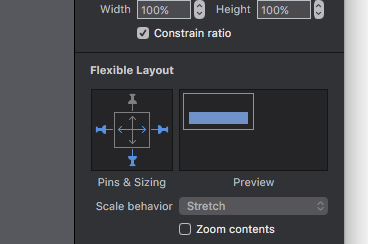
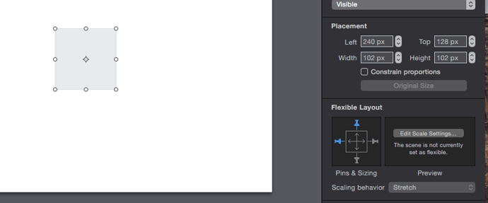
The simple way to do it without additional coding is to create your scene. Build the nav bar, fix it to the bottom using the Flexible Layout options.

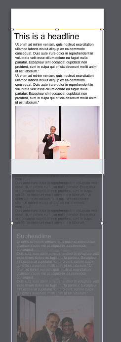
Next create your page content so it goes way off the page. I usually do this on another page without the nav bar.
Now select all and group those objects together, then copy and paste into your actual scene.
Select the group and pull the lower handle up so it sits just above the navbar. Make sure you bring the Navbar forward if you want the content to look like it’s emerging from the base of the screen and be affected by any shadows.
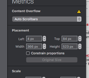
In the Metric section, set Content Overflow to either Scrollbars or Auto Scrollbars and preview.

You should have a nice scrolling section with all the kinetic stuff if you’re using an iPhone or iPad.
Great idea and thanks for posting this. It helped me to create sticky navigation buttons while I had other non-sticky elements in my scene. Assigning different flexible layout settings and grouping it all did the trick!

