To your point yes, not many people know about Hype but that will change. Off topic but maybe related, I took deep dive Into Apples motion today and boy was it a roller coaster, in a complex way. The terminologies they use it are other worldly. I’d say hype is a stripped down version of Apple Motion and allows for both motion graphics and html output in a clear cut, easy to understand scenario all in a nice interface.
I fully agree with your points comparing Motion to Hype. But don’t discount Apple Motion. I have used that program since it has been around. It is so much better than any Adobe product. The simplicity and ease of the interface (as compared to adobe suite) is a huge time saver and leaves little room to wonder “how do i do that?”.
Full circle… The simplicity of both the Hype and Apple Motion interfaces demonstrate how simple an interface can be, but still provide the power and flexibility required today. Coupled with the support of this forum, I feel that I can achieve almost anything I can imagine using Hype.
D.
I’ve probably mentioned it before - Keynote was the biggest influence on v1 of Hype, but we stole the Record button from Motion, and for v1.5 used a similar paradigm in Motion that separates the element list and uses that selection to show the below properties. I haven’t used it for much real production work, but I’m definitely a fan of may of their design decisions.
3 Likes
Just finished watching this, I tell you theres somethings you might just want to consider borrowing.
For example, motion has this handy dandy shortcut that if you press anywhere in the timeline say 2 second mark and press the “i” key on your keyboard the recorded part moves to 2 seconds or anywhere you clicked in the timeline where you want the recorded sequence to start playing from, very handy shortcut.
Also, recorded handles seem fluid when dragging to shirk or enlarge the recorded parts
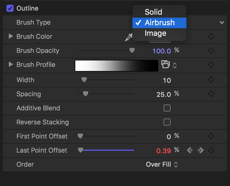
Motion has line draw too they refer to it as “First Point Offset” and “Last Point Offset” Hype has just one from right-left id have to rotate the object might be cool to specify where start from line draw?
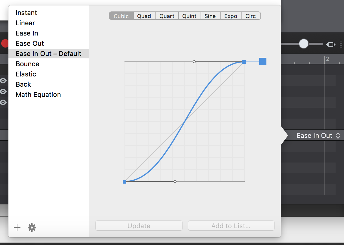
I got a bit lost with easing in motion, hype makes it effortless to add easing and preview the different easing presets.
Above took me a while do in Motion but the upcoming version of hype can crunch this out in no time.
(I split this to a new topic)
I believe the notion of In and Out points are more applicable to the video world than the web world. With Video (and Flash had the same basic idea) the life cycle of a "layer" is often much shorter and doesn't re-appear once used frequently. With HTML it is more expected that elements will stay around.
(that said I'd still like to make the display visible/hidden a bit easier to use)
Can you elaborate?
Oh, that's nifty! I hadn't looked at how they did vectors. I'll definitely file this.
(And as an aside, I do at least want a way to rotate/reverse anchor points which would handle some of this case)
In some ways, I really love the timing functions with Motion; in fact given the name "Motion" it does make sense that they are so front-and-center in the interface. But they maybe aren't the easiest to use in simple cases and can be visually jumbled a bit. With Hype's timing functions I wanted to make sure we had as much flexibility as their timing functions. Hence we opted for a bezier path with unlimited anchor points instead of the more common single cubic bezier that CSS and other software use. While Hype's UI is a bit more standard with other animation apps, I'd still like to improve the visuals so it is easier to tell the timing function at a glance.
Im glad Hype exists because its all manual labor in Motion, the fact that they don't have presets is a pain in the neck plus they have words like 'Logarithmic'? ![]() I had to look that up.
I had to look that up.

When Hype has lots of elements recorded in the timeline theres this almost delay/stagger in reposition /expanding recorded blocks, I didn't experience this in motion granted they're totally different apps, one is made for motion designers and the other html output but could also handle motion design.
Heres the motion file you can go to the shape preference and see the results you select shape.
MotionJD.zip (6.8 KB)
 Id love it if Hype had this in the customizer toolbar instead of the word share it be export < HTML, Movie....
I suspect that SVG filters should be able to do an airbrush effect, but it will probably have a high computational cost. I’ve noted your feedback about an export toolbar item in our tracker item covering it!
One feature I just found while playing around was that if you are recording in motion and hit play, you can move elements and it will plop down keyframes in real time. I’ve wanted to add true “recording” for a while to Hype - they do it in a clever way! Double-clicking the record button gives some options for it.
Airbrush is what it gives it a smoother path vs jagged when its animated the lines much line draw in hype.
Cool, I was not aware of that.
Thanks for putting on the feature tracker.
1 Like
I preferred it before they zonked the UI and dropped the detachable palettes - chasing the lowest common denominator and disregarding the pros who use palette monitors. Being forced to constantly tunnel down made me feel like my elbows ere strapped to the chair arms. The drop in productivity was so serious that I stopped using it. It used to be absolutely brilliant, but this is what Apple did with all its video apps.
1 Like
Apple as a forward thinking company is hinting at If you require a wider screen monitor you should consider upgrading to a newer ‘standard’ of super wide screen monitors to use their video or audio apps instead of draggable palletes on different monitors which maybe an old school approach. On a different note, If you think about it, Apple has/had always dictated when you should upgrade or what you use and enforce the idea that a working older Mac is absolete regardless of the fact it can run the OS or not and in most it does but requires extra work to which they don’t break a sweat to make their modern OS to work with an older Mac which it can, and they deliberately want you to go out there and spend.
Some actually are for the idea and others have a problem with that and there you have it apple for you.
That’s not what’s happening. There are two things that happen at Apple in this regard. First, Apple changes things to suit its perceived demographics, which is consumers. Second (as I have observed constantly over the past 20 years) is that they will come up with some new idea and through a process of tunnel-visioned genius, they are so focused on the new shiny thing that they forget about a lot of the cool stuff that they introduced over the previous years. As the project leads are not real-world users, and with Apple’s ivory tower mentality, they simply pave over things without any awareness of what cool stuff is being destroyed. It is system-wide at Apple. Lots of examples. Take iPhoto - for a while it was ideal for professionals. We could instantly find and organize anything and instantly access whatever asset we wanted. Then, with Apple’s consumer-oriented tunnel vision, they didn’t understand how pros were using it, and they killed the very thing we liked about it. (Many pros use a $3K asset manager but a ton of in-house corporate departments look for something cheaper, and iPhoto was free.)
Throwing out babies with the bath water is an aspect of “progress” at Apple. Another example: Did you know that for a couple of decades a Mac would always know the exact situation with every closed window, even those on removable media. If you set a window to display in a certain format (icon / list / icon scale, etc) with a certain screen location and size, then close it (and even unmount the drive) the next time you opened it, it would remember every setting, even if you hadn’t accessed that window in years. You could even use that drive on a different machine and it would remember everything. You can’t do that with OS X.
I run a pair of 27s. Having palettes on a second monitor (as with Adobe apps) means that you can instantly go to any palette in a split second. Apple’s decision to force users to constantly tunnel up and down through nested palettes is aimed at the lowest common denominator – single screen, non-agency user. It shoots productivity straight down the drain. With Motion as an example, there was a productivity drop among serious pro users of around 85%. When you are juggling a dozen deadlines and speed is essential, one cannot take such a hit. This is why Motion is not commonly used by graphics pros. No matter how intuitive and powerful certain things are (such as the automation of just about every control), if you end up losing an hour a week because of this, that hour times fifty weeks adds up to losing six and a quarter working days a year.
Work-at-home freelancers can make the time, but if you’re at an agency and you’re chasing dates on gantt charts, you must turn in your project when it’s due. With a place like a TV station something can come up and you may only have fifteen minutes from start to finish. If it takes just a little too long to achieve perfection, you and your client must settle for imperfection. The key term is “frenetic”. While this term may apply internally to how Apple drives its workers, it doesn’t apply to how Apple views its customers. Apple almost drove itself out of business because of this disconnect.
If Hype were to develop such an extreme tool set as an app like Motion, I would hope that they would provide the option of taking palettes and tabs, pulling them apart and allowing some of us to use a palette monitor.
2 Likes
I am doing a lot of work in Rapid Weaver, and the menu tunneling takes a LOT of getting used to. There are a lot of themes, stacks, etc and each developer has their own take on the organization of the menus. It requires a lot of memorization. In all other respects I like it a lot.
Strong vote for tear off menus in Hype.
Btw, I never said the concept of pallets is old school even though I wrote it, I still think its a standard for professionals that have more than one monitor. I was merely saying what apples software engineers had in mind when they yanked it from the new version of Motion.
The tunnel vision that you brought up, you are def right, they’re so into the concept beautifying or re-envisioning the apps or the experience they often do a 180º and chuck important rudimentary options and or features that were in previous versions.
iMovie was another example. I was an Apple rep when it came out and I was at retail stores (Best Buy, etc) demonstrating it. It was so ridiculously intuitive an eight year old kid could be instantly productive: Clips here / FX here / titles here / timeline here.... done! It was revolutionary. Suddenly teachers were using it in schools, etc. Even Francis Ford Coppola put out a video praising Apple for this app and how it was revolutionizing the industry at the ground roots, pulling in new video editors like a vacuum cleaner. Apple improved it through a number of upgrades and even opened it up to third party plug-ins, butthen Apple decided to be Apple - they decided to bring in a new guy who trying to make his mark. Suddenly the interface was cluttered to pieces. Users upgraded and hit a brick wall. Within a year 95% of iMovie users fell away. They were replaced by a new generation who didn't know how much easier and more intuitive the earlier versions were. This is a lesson to be learned.
1 Like