Hi Todd,
There are a few approaches to making your project responsive. However, they require to some degree use of the
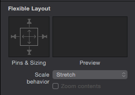
area in the Metrics Inspector (⌘3)
I personally would create at least 2 layouts starting with the smallest (for mobiles) and then a larger one (for laptops) working your way outwards.
Once you create more than one layout your Scene inspector (⌘2) will change to Layout Size. Here you can set the size of your layout by choosing from the extensive drop down menu.
You can then change the 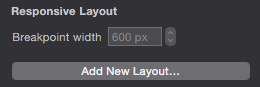 breakpoint for the width if you need to.
Here is a handy example of embedding objects in objects and how you would set them according to the scene using the Flexible Layout box shown above. This should help you understand a bit more of how to use the "pins" and "scale arrows".
This should help you on your way to understanding responsiveness in Hype. I would follow this and group your objects (according to your website example) together and apply the same principles.
Hopefully this should get you going.