There are a few approaches to making your project responsive. However, they require to some degree use of the
area in the Metrics Inspector (⌘3)
I personally would create at least 2 layouts starting with the smallest (for mobiles) and then a larger one (for laptops) working your way outwards.
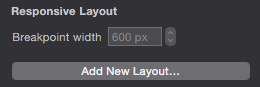
Once you create more than one layout your Scene inspector (⌘2) will change to Layout Size. Here you can set the size of your layout by choosing from the extensive drop down menu.
You can then change the breakpoint for the width if you need to.
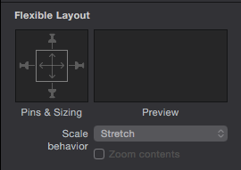
Here is a handy example of embedding objects in objects and how you would set them according to the scene using the Flexible Layout box shown above. This should help you understand a bit more of how to use the "pins" and "scale arrows".
This should help you on your way to understanding responsiveness in Hype. I would follow this and group your objects (according to your website example) together and apply the same principles.
Oh wow… MUCH better! It’s not what I expected, but it just tested out on the iphone, macbook and a desktop PC with all three main browsers… the only one that it didn’t look right on was the Internet Explorer… of course, Microsoft?!
Before anyone responds to the Microsoft comment… I have to tease my Bro-in-Law who is the Manager of the Product Development Lab ‘at’ Microsoft, Redmond, WA Campus! lol
Thanks a bunch to DBear and Daniel… the input yesterday and today have really helped me get up to speed using Hype and doing a website again. I knew the process had changed but WOW?! It’s like I never wrote a website before! In fact, I pretty much had to forget that I had and everything about what it used to require and just learn how to do it from scratch!
Anyway, thanks for your patience and the Assist(s)!!!
 breakpoint for the width if you need to.
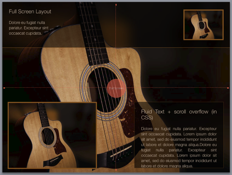