Create a Shadow for Images

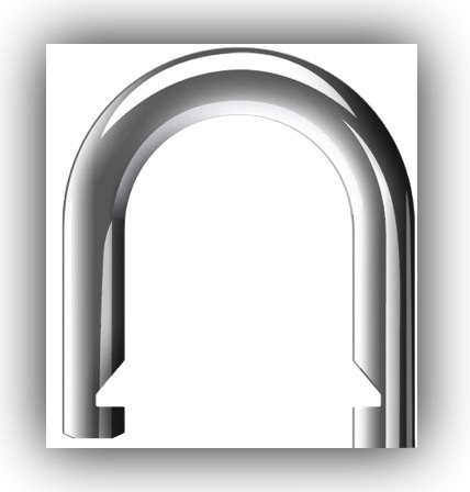
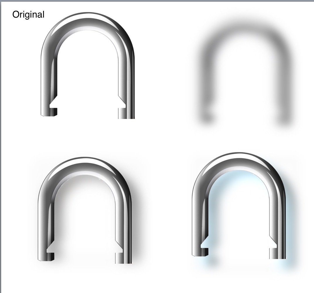
Sometimes you will be using an image in an animation and want it to have a shadow.

The problem is that the image is in a rectangle container and you can only place the shadow on the containing rectangle using the Shadow Blur options in the Element Inspector. This puts a shadow around the Rect and not the image shape.

But what you can do is duplicate the image and use the Opacity and Blur tools to make the duplicated image look like a shadow.

You can even use the other tools sepia, Hue, Saturation to change the shadows colour.

Once you have the shadow as you want place it behind the original image and offset it as a shadow.
You can also adjust it’s size and uncheck constrain proportions to reshape it.

Then Group the the Original and Shadow together

Here is a example Project showing a couple of examples.

Image Shadows.hype.zip (89.4 KB)

11 Likes

quite good hint!
simple and useful.
thx

1 Like

Smart :smiley:
Very useful idea.

1 Like

That’s nice - thanks.

1 Like

Good one - Thanks.

1 Like

hah, nice! This is a great way to get things done without additional software tools, thanks!

1 Like

Another technique you can use for transparent PNGs is the CSS3 Filter Effects drop-shadow. While Hype doesn’t have built-in support, it is fairly easy to add this to your elements. Here’s what you’d do:

Step #1: Edit the Head HTML in the Document inspector and add a CSS class that will apply a dropshadow:

<style>	
.dropshadow {
	-webkit-filter: drop-shadow(5px 5px 10px rgba(0,0,0,.6));
	filter: drop-shadow(5px 5px 10px rgba(0,0,0,.6));
}	
</style>

Step #2: For any element you want the drop shadow, go to the Identity Inspector and set the class name to match, in this case “dropshadow”.

Note that this won’t work with IE at all. Please the caniuse page or MDN page for more info. Also, if you have applied filter effects it also won’t work (though you could put !important at the end if you really wanted).

4 Likes

Also animated ( on DOM load)
I modified the code above.

<style>
.dropshadow { 	
-webkit-filter: drop-shadow(0px 0px 3px rgba(0,0,0,.4));
filter: drop-shadow(0px 0px 3px rgba(0,0,0,.4)); 
-webkit-animation: shadow_animated 0.3s ease-out both !important; 
animation: shadow_animated 0.3s  ease-out both !important;       
-webkit-animation-delay: 0.65s!important;   /*delay*/
animation-delay: 0.65s!important;  
 } 

/* from 0% to 100% in 0.3s + 0.65s delay  */   
@keyframes shadow_animated {
0% { 
-webkit-filter: drop-shadow(1px 4px 3px rgba(0,0,0,.4));  
filter: drop-shadow(0px 0px 3px rgba(0,0,0,.4));
 } 
100% { 
-webkit-filter: drop-shadow(0px 5px 10px rgba(0,0,0,.6));
filter: drop-shadow(0px 5px 10px rgba(0,0,0,.6));
}  
}  

@-webkit-keyframes shadow_animated {	
0% { 
-webkit-filter: drop-shadow(1px 4px 3px rgba(0,0,0,.4));
filter: drop-shadow(0px 0px 3px rgba(0,0,0,.4));
 } 
100% { 
-webkit-filter: drop-shadow(5px 5px 10px rgba(0,0,0,.6));
filter: drop-shadow(0px 0px 10px rgba(0,0,0,.6));
}  
}
</style>

Michelangelo

1 Like

Yes, very cool. It might be more appropriate to run on a scene load. I’d also like to build these shadows into Hype so code isn’t necessary!

1 Like

HI jonathan
I created a full list of animations for Awesome icons, like the animate.css library
On dom load and on scroll the page. For the rest I think is better Hype with its timelines because you can't customize the class every time.

@MarkHunte @gasspence @Olof @Djon @jonathan
UPDATE:
here an example, now you can run the CLASS with toggle behavior, one time or in timeline .
I’ve added some javascript to manage the class.
it is a good solution? normally I use this method

VIEW DEMO


trigger_animated_class.hypetemplate.zip (146.3 KB)

regards
Michelangelo

2 Likes

@michelangelo

Thanks for the code:

You can also use: $("#element").toggleClass("dropshadow"); with this which works a toggle on/off and also can save on a couple of lines of code. :smile:

@MarkHunte thanks!

I added a pause with the same duration of the animation, otherwise it will stop not properly.
your code is perfect, however in this animation I turn off the class automatically

1 Like