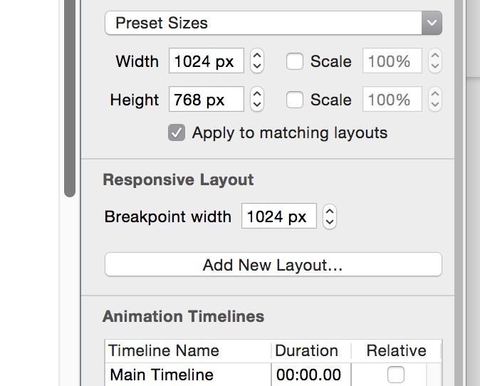
Hi there. I love the new responsive layouts, but it would be great to have control over when the document will pop to a breakpoint. Currently a 800px wide layout will jump to its 320px mobile layout once the browser is scaled to 799px. It would be nice for there to be a way to make it wait until its closer to 320px before it jumps.
many thanks
