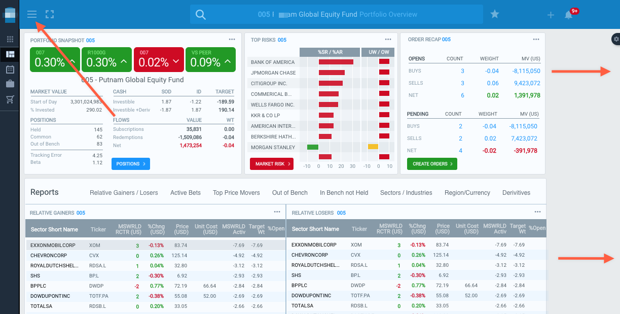
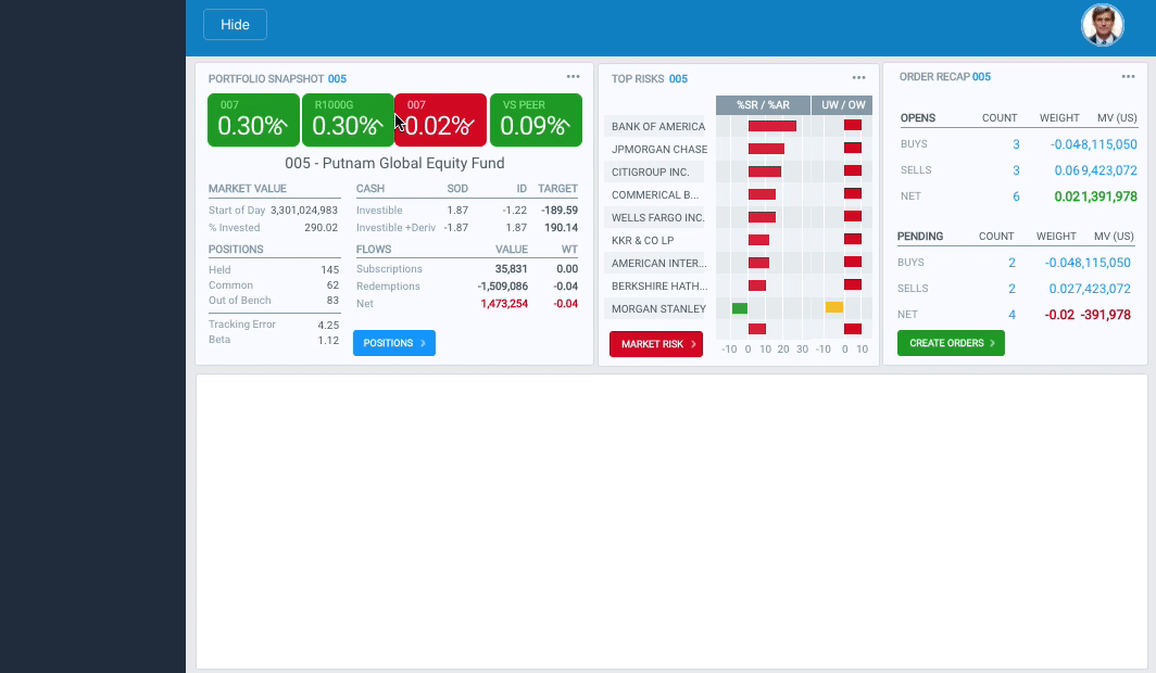
I have a responsive dashboard page with a button to minimize the left side navigation bar.
To do this I start a timeline where the nav bar width is reduced and the content area width is increased.
This creates a wider space to the right. I don’t want to create new, wider versions, of everything to simulate stretching and filling the space. If I adjust the width of the browser window all the elements stretch perfectly.
Is there any way to get these elements to stretch and fill the space like they do when the window is resized???
Since those three groups (Risk, Orders, and Portfolio) are groups set to stretch based on their parent group’s flexible layout settings, when the whole group is moved left the layout of the three modules need to also be resized so they behave as expected. So part of the hide.nav timeline needs to also have some readjustment for those modules.