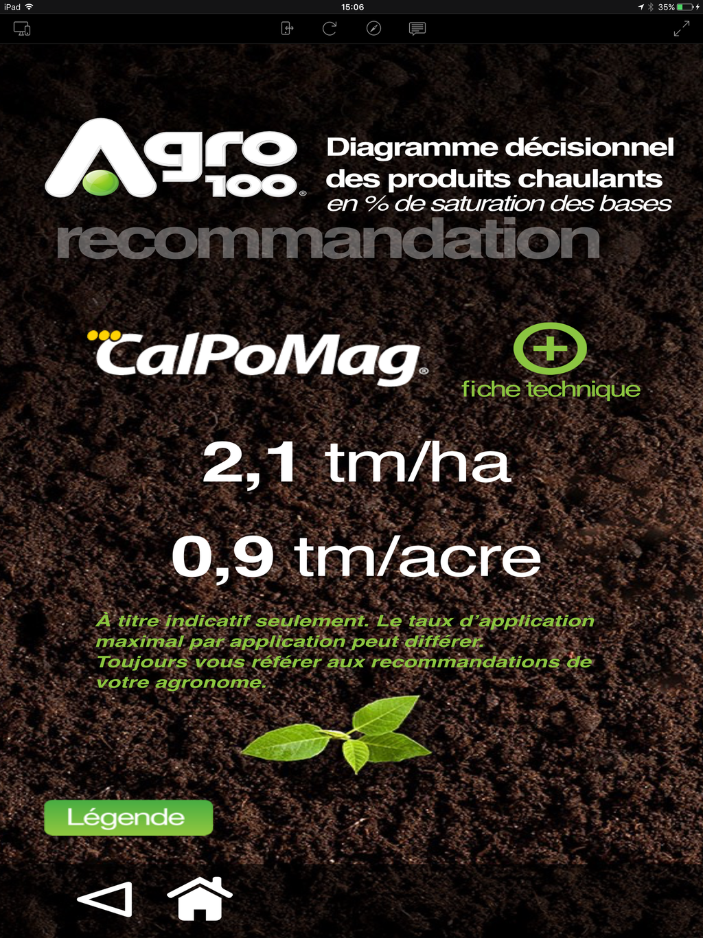
Hi. I’ve created an iPhone app for a client with Hype. Now the client wants us to make it available for the iPad. The iPhone app was created with a resolution of 320 x 568. Everytime I look at it on an iPad it looks squashed. Is there a way or a strategy to make sure we have a good rendering on all the devices?
Are you currently doing anything to scale the app? (by default if you did nothing it may just appear small and not squashed).
Hype has two built-in systems for fitting to different devices:
- Responsive Layouts - have entirely different content that is shown based on “breakpoints” of width
- Flexible Layout - Adjust element positions and sizes based on the browser (or container) width and height.
The flexible layout system can scale elements, and there are options to scale elements so they can maintain their proportions:
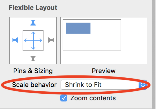
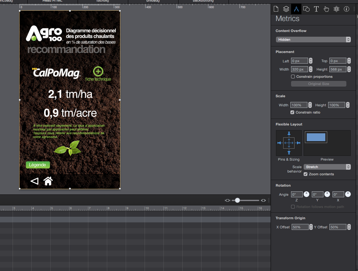
Great - you’re already using the Flexible Layout! In this case, if you change the scale behavior to “Shrink to Fit” you’ll get the desired result.
(P.S. What version of macOS are you running? The “scale behavior” label looks like there’s a layout bug since should be on one line!)