Hello
I am having a problem getting a basic responsive layout to display properly on my Android Samsung phone.
I have a text box, with a rectangle underneath it. In a desktop layout it works fine. I made a mobile layout (360 x 640), which involved squeezing the text box, and repositioning the rectangle. Both layouts look fine in preview mode in the various browsers.
I have exported the project and uploaded it to a server, and when I view it from my computer using a desktop browser (Safari, Chrome, Firefox) it looks fine, both in normal mode and in developer-mode activating a phone emulator.
However, when I view it using my actual phone (Samsung Galaxy S7), the layout is incorrect - there is a substantial collision between the text box and the rectangle. This is particularly bad in portrait mode, but there is still distortion in landscape mode, (which triggers the desktop layout since the breakpoint is set at 600).
I have also checked this with a Galaxy S10, which shows the same problem. I do not have an iPhone, so have not checked it on that.
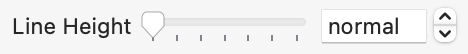
We've found that the line height value of "normal" can have a lot of variance across devices that lead to problems like this. If you set the line height in the typography inspector to 18 does it look consistent to you across all devices?
I removed "px" from the line height (but kept the numerals "18") and hit the "Enter" key. The text box displayed correctly on Safari iOS > iPhone 7+. I then added "px" back into the line height (so it read as normal, i.e. "18px") and hit "Enter" key; still rendered correctly. To see if this was a transitory phenomena I saved a copy and closed it. Re-opened the copy and checked the layout - the "correction" did not disappear.
To clarify, the issue is when the setting has never had a value set in Hype, which is is the CSS value of normal and is displayed that way in the inspecctor. By setting an explicit number, that is used by browser text layout instead of making its own choice. Mobile browsers tend to choose a different multiplier of the font size than desktop browsers with this value.
While the CSS spec would treat 18 and 18px differently, Hype only accepts px values in that text field. It is an animatable property and needs to maintain the same type, so Hype always force it to be a pixel.
(It is likely this will change in a future release and we'll use a multiplier value and set a default so mobile/desktop looks the same)
@BillH's file had an "18px" value to begin with, which I assume qualifies as a value being set in Hype - there was no "normal" in the line-height box. In my experiments simply removing the "px" leaving just "18" (then hitting the Enter key) worked to get the text field to display correctly on my iPhone. I put the "px" back in again to keep things kosher.
Anyway, that is what worked for me (Please see screen capture below. Best viewed on full screen so You can remove the controller out of the way before the video starts). I am curious if that proves to be true for others using @BillH's original file.
Thanks Jim and Jonathon for your input.
I have been doing some experiments, and here are the results.
It's nothing to do with the responsive layout itself - the problem still occurs if I just generate a single scene with a 360 x 640 size. When exported and uploaded to the server it looks OKish in a desktop browser (actually a bit misaligned, but not really bad) , but badly misaligned when viewed on my phone. https://www.st-andrews.ac.uk/~wjh/test/test-fixed-default.html
Like JimScott, I do not see "normal" as the text height value in the Hype Text Inspector. I see "18 px" as the default value right from the beginning.
I re-edited the text height back to 18 px, and exported and uploaded that. This too looks fine when viewed on the phone, even though the text height is ostensibly back to its original value that caused the problem. https://www.st-andrews.ac.uk/~wjh/test/test-fixed-changed-18.html
So following on from what Jonathon said, my guess is that Hype thinks the initial text height is CSS "normal", even though it is showing 18 px to the user (me), and that "normal" displays differently on the desktop and phone. When I edit the value down to 17, and then back to 18, I am forcing Hype to actually replace some internal value of normal with the explicit value 18. This might fit with JimScott's experience where editing by removing the "px" fixed the problem. However, a problem with this theory is that the Hype file JimScott supplied still shows the problem on my phone when I exported and uploaded it! But maybe replacing the "px" re-created the problem. https://www.st-andrews.ac.uk/~wjh/test/test-responsive-hype_JHSv1.html
Anyway, I think there might be a bit of a bug in Hype in this matter. Will this correspondence get back to the developers (if you agree with the analysis, Jonathon), or should I report this separtely as an "issue"?
I'm the developer, so there's no need to file this separately! I do thank you for the consideration .
As such, your analysis is sound (that there's no actual value set and uses "normal" on the page), but I'm still pretty baffled that it would be showing a value other than "normal" in the Hype typography panel on a fresh download of your document.
Do you mind making a screen capture that shows downloading from this forum post, opening that document, and then showing the typography panel?
It would also be useful to know which version of Hype and macOS you are using. Thanks!
Hi Jonathon,
Sorry about the developer confusion - you are clearly a person of many talents (and hats!)
I made a video of the steps as requested, but it has ended up 88 MB in size, and I got a message saying this was too large when I tried to upload it to the forum. I could put up a 7-day Dropbox link if you wanted (or let me know if there is some other way I could get it to you).
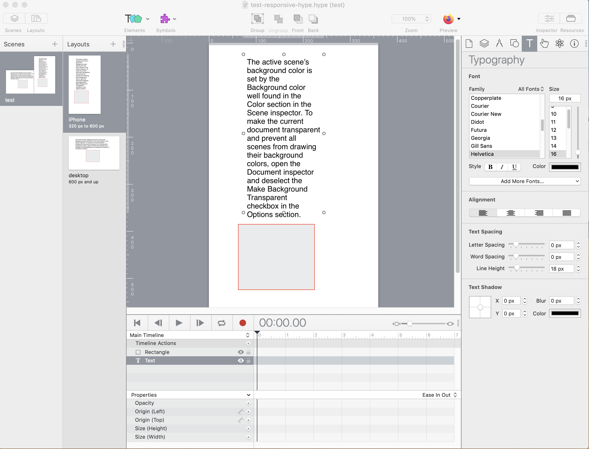
But I went through the various steps as a "fresh" user - clicked on the "test-responsive-hype.hype.zip" link in the forum web page, saved it to the desktop (which is not where the original resides), double-clicked it to unzip it, then double clicked on the file "test-responsive-hype.hype" to open it in Hype, then clicked the text box to select it, then opened the Typography inspector. Here is a screenshot of the Hype window:
As you can see, the line height is definitely showing as "18 px". (I also notice that the letter and word spacing are both showing "0 px" even though the sliders are not hard over to the left - is that expected?).
I am using Hype Pro version 4.1.3 (720) and the MacOS version is Mojave 10.14.6.
Looks like this is the culprit! I can reproduce it. macOS 10.15+ display normal but macOS 10.13 and 10.14 show the 18 px value, which even dynamically changes if you change the font size. It was definitely normal in earlier OSes.
So basically on macOS 10.14, it looks like it is explicitly set, but is not. By changing the value you will explicitly set it, and this will allow it to be consistent across devices.
Due to the main inconsistency issue you are hitting, we have plans to always have the line height set in a future version, so I imagine unset values won't really occur with the normal/value difference.
Exactly. I do it all the time without thinking about it: forcing a "reset". My first candidate was "Position with CSS left/top" in the "Document Inspector". Always experimenting. I assumed by not entering the "px" that Hype was adding it back on its own.
Thanks for getting to the bottom of this (and to JimScott for confirming the issue). Now I know what's going on I will just set the value explicitly, unless/until there is a change in a future version.
Bill H
 .
.