Hey guys,
We’ve had this problem for a while for ads and we’ve avoided using text with the built in fonts with hype because of it.
When you set up text in hype it resizes text on different tablet models
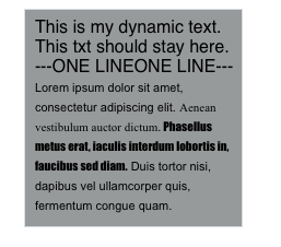
Desktop:
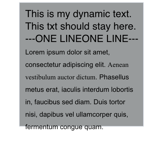
IOS:
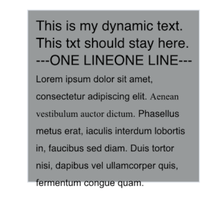
Android:
And on different androids it tabs slightly differently. Is there a way to make it consistent on all devices WITHOUT using liquid layouts/keeping the file dimensions as static numbers. Thought it’d ask
Thanks
Problem with that is there may be 10 types of androids and 3-4 models of ios tablets people could be browsing and i have to be account for all of those as well as the fact that if it doesnt encounter any of those it could default to a font thats way too huge for a weird android model. I’m not sure if its worth the hassle over exporting it as a png, but thanks for that feedback thats a good way to do it if i didnt have tight deadlines
Thanks for that, that’s a neat command. I was talking to a co-worker about this, he’s made a script based off something like what you’re doing for hype, but the issue he’s running across is random text going to the next line, overflowing outside the textbox and other unexpected behaviour while yes it scales down. Kind of like the screenshots where the text leaves the box.
@Luckyde This happens if you put more fonts into a single paragraph?. I had this problem several times and not only in Hype. In android the text is always a bit different.
I’ve include the above script in my Hype project and on every platform the font size is changing but on an Android smartphone nothing happens. Does anyone of you guys know why it is and maybe have a solution?
Do you consider this a bug then? If so, do you mind sending a zip of your .hype document (perhaps the broken and fixed version) to support@tumult.com and we can see if there are changes we can make to improve it? Thanks!