Hello,
Please check the screenshot:
or check at https://www.mi.com/mi8ud/
is it SVG font or by CSS please?
I tried that effect in Hype, but I failed, and suggestion please?
Alex
Hello,
Please check the screenshot:
or check at https://www.mi.com/mi8ud/
is it SVG font or by CSS please?
I tried that effect in Hype, but I failed, and suggestion please?
Alex
chromebrowser:
do a right-click on the element
click check element
switch to computed
inspect the computed styles
find css-properties background-clip: text, background-image:url(https://i1.mifile.cn/f/i/2018/mi8ud/mark_04.jpg); and text-fill-color: transparent
Dear @alexlii it’s all at your fingertipps! please throw away lightshot and try to find some curiosity and discovery spirit 
https://www.w3schools.com/code/tryit.asp?filename=G60THDAR3RDJ
... also please use the search on this forum and the web in general for regular CSS and JS. The tone of the requests also sometimes seams to get lost in translation, I guess. I as a co-users am very often willing to help on my free and unpaid time and @h_classen is, in my opinion, pointing out that seeing an effort on part of the people seeking help certainly makes a difference.
So please search the forum and this might help too ... here is an older file from last year:
Hope this helps
Hello @h_classen and @MaxZieb,
Your examples are so great and over my expectations, and thanks so much.
I understand the way of @MaxZieb is by custom class, and it is great way to show a smooth hue color gradient.
Meanwhile, the way by @MaxZieb seems easy for me  since I can insert that sample code into a Hype text element.
and I slightly change your sample CSS to the following piece:
From:
<!DOCTYPE html>
<html>
<head>
<style>
#example1 {
-webkit-background-clip : text;
background-image : url(https://i1.mifile.cn/f/i/2018/mi8ud/mark_05.jpg);
background-position-x: 50%;
background-position-y: 50%;
background-size: 100%;
color: rgb(255, 255, 255);
font-size: 96px;
font-stretch: 100%;
font-weight: 400;
text-align: center;
-webkit-text-fill-color: rgba(0, 0, 0, 0);
}


</style>
</head>
<body>


  <p id="example1">this is a <br>spectacular effect</p>


</body>
</html>
To:
<style>
#example1 {
-webkit-background-clip: text;
background-image: url(https://i1.mifile.cn/f/i/2018/mi8ud/mark_05.jpg);
background-position-x: 50%;
background-position-y: 50%;
background-size: 100%;
margin-top: 0px;
color: rgb(255, 255, 255);
-webkit-text-fill-color: rgba(0, 0, 0, 0);
}
</style>

  <p id="example1">this is a <br>spectacular effect</p>
So that I can control the font size and weight by Hype Typography tools.
Thanks, yes I have a test by replace that image url with a mp3 video, and I found it works, this is really Amazing:
and I already upload it to wordpress for your check at Shop | Lovcour.com Smartwatches,Headphones,women's fashion backpacks,Laptop Backpacks,Suit Garment Bags,Camping Hiking Backpacks,Photography Backpacks,Schoolbags,Duffel Bags,outdoor sports backpack,Business Bags,Lovcour Travel Luggage Bags
This means it is really convenient to show the amazing effect without need to make Text SVG mask.
Unfortunately, there are two issues:
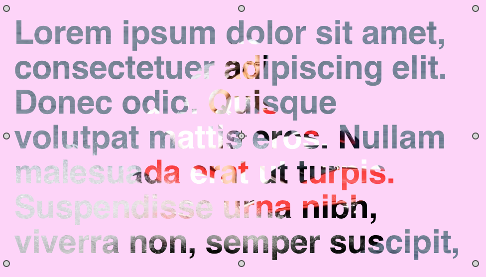
1#If there are two texts element with different background image url, they will disturb each other, and only one background will show up as the above screenshot.
2# That page content will only show up on Safari, but not show up both on Chrome and firefox.
So, It would be great if the above issues could be fixed, and really thanks for your great works.
Here is the Hype document for your check:
Font_gradient_by_h_classen.hype.zip (29.3 KB)
Thanks and have a nice day.
Hi @MaxZieb,
It works when preview in Safari, firefox and chrome. but when I upload it to a site, it does not work in any browser, I mean there is no Gradient, please check at Shop | Lovcour.com Smartwatches,Headphones,women's fashion backpacks,Laptop Backpacks,Suit Garment Bags,Camping Hiking Backpacks,Photography Backpacks,Schoolbags,Duffel Bags,outdoor sports backpack,Business Bags,Lovcour Travel Luggage Bags
By the way, it seems a great way to add class so that it can apply any text, is it possible to use an image as text gradient background too by the class way?
I tried this class:
	<style>
	.colorGradient{
		-webkit-background-clip: text;
		background-image: url(https://i1.mifile.cn/f/i/2018/mi8ud/mark_05.jpg);
		background-position-x: 50%;
		background-position-y: 50%;
		background-size: 100%;
		margin-top: 0px;
		color: rgb(255, 255, 255);
		-webkit-text-fill-color: rgba(0, 0, 0, 0);

	}
	</style>
But it does not work, any thing I missed please? here is the Hype document:
GradientHeadlineby_MaxZieb_with_URLimage.hype.zip (42.4 KB)
Thanks
Thanks.
I am trying to put your sample CSS as a class so that it can be used flexibly, but when I put it as a class, it does not work,
Any suggestion please?
You are trying to override Hype’s css.
Your css will not be more important than Hype’s inline css it places on the elements.
To make your css more important than hype add !important to the end of each property in the css.
In the css you are using simply replace every semi-colon ; with !important;
or possibly even simpler - just add [style] after class name:
<style>
.colorGradient[style] {
	-webkit-background-clip: text;
	background-image: url(https://i1.mifile.cn/f/i/2018/mi8ud/mark_05.jpg);
	background-position-x: 50%;
	background-position-y: 50%;
	background-size: 100%;
	margin-top: 0px;
	color: rgb(255, 255, 255);
	-webkit-text-fill-color: transparent;

}
</style>nice 
Yep thats nice although I could not find anything on using it apart from a css trick post which does not have much detail and also uses !important ?
I am assuming it is indeed a hack on attribute specificity selectors in css and actually may be a prefered method than using !important. ( please don't for one instance think I know what I am talking about, just thinking out loud after a quick look around )
I can’t remember where I found this. If you search for “override inline style”, there are a few hits.
Most of them seem to recommend using both [style] after the class name and !important, which would be a very high level of specificity.
In this case, however, it seems to be enough to use one or the other.
Hello @h_classen
I tried in three ways:
First one:
    <style>
	.colorGradient1[style] {
		-webkit-background-clip: text;
		background-image: url(https://www.lovcour.com/wp-content/uploads/sites/2/2019/05/My-Girlfriend-is-An-Agent-e1493668518484.jpg)!important;
		background-position-x: 50%;
		background-position-y: 50%;
		background-size: 100%;
		margin-top: 0px!important;
		color: rgb(255, 255, 255);
		-webkit-text-fill-color: transparent;

	}
	</style>
second one:
    <style>
	.colorGradient {
		-webkit-background-clip: text!important;
		background-image: url(https://www.lovcour.com/wp-content/uploads/sites/2/2019/05/My-Girlfriend-is-An-Agent-e1493668518484.jpg)!important;
		background-position-x: 50%!important;
		background-position-y: 50%!important;
		background-size: 100%!important;
		margin-top: 0px!important;
		color: rgb(255, 255, 255)!important;
		-webkit-text-fill-color: transparent!important;

	}
	</style>
Third one:
<style>
	.colorGradient3[style] {
		-webkit-background-clip: text!important;
		background-image: url(https://www.lovcour.com/wp-content/uploads/sites/2/2019/05/My-Girlfriend-is-An-Agent-e1493668518484.jpg)!important;
		background-position-x: 50%!important;
		background-position-y: 50%!important;
		background-size: 100%!important;
		margin-top: 0px!important;
		color: rgb(255, 255, 255)!important;
		-webkit-text-fill-color: transparent!important;

	}
	</style>
but all of them works in Hype preview in only Safari and Chrome, but not work Firefox.
And all of them does not work when they are uploaded to wordpress, here is the page which included in those three test document:
https://www.lovcour.com/gradient-font-test/
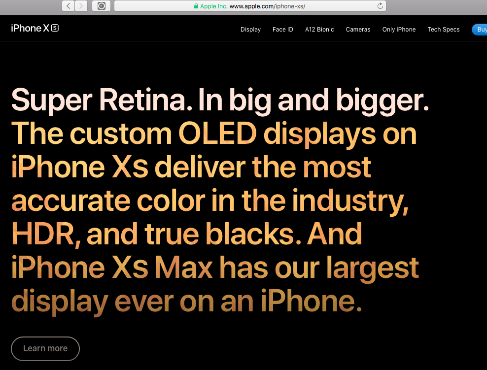
By the way, I found a page with similar effect:
at https://www.apple.com/iphone-xs/
is that same way to achieve the effects please?
It would be great if you could have a check these document and make it work. Here are my tested three documents:
fontgradientbyhclassentest1.hype.zip (15.2 KB)
fontgradientbyhclassentest2.hype.zip (15.0 KB)
fontgradientbyhclassentest3.hype.zip (14.4 KB)
Thanks in advance.
I copied the CSS from the Apple site:
gradient test 2.zip (105.9 KB)
I think the missing piece was making sure the text itself is transparent, which was accomplished with:
.masked-copy {
    -webkit-background-clip: text;
    color: transparent !important;
}
This has the downside of being invisible while the image loads. The class was applied to the text element in Hype.
Hello Daniel,
Thanks, it works in preview mode with Safari, chrome, and Firefox.
But not work in any browser after it is uploaded to wordpress, please check at https://www.lovcour.com/gradient_testbydaniel/
Thanks
You have to transfer all definition from Head HTML into your additional style CSS in your WordPress customizer.
An alternative is to add to style.css in your theme (but make sure to use a child theme so you can still update the main theme without loosing the modifications).
Another alternative is to use a plugin like snippets.
You have a few options:
Switch the embed mode to ‘iframe’ in the panel for the Hype Animations plugin. There is CSS that is in the ‘head’ of the Hype document I shared which handles the gradient. When embedding as a ‘div’ (the default) this code is lost.
Include this css directly in the Text Element. You can use the <style> tag anywhere.
The document below would work as an uploaded OAM widget
gradient test 3.zip (72.9 KB)
Include this CSS in your Wordpress theme’s CSS, or as additional ‘custom CSS’ somewhere on that page:
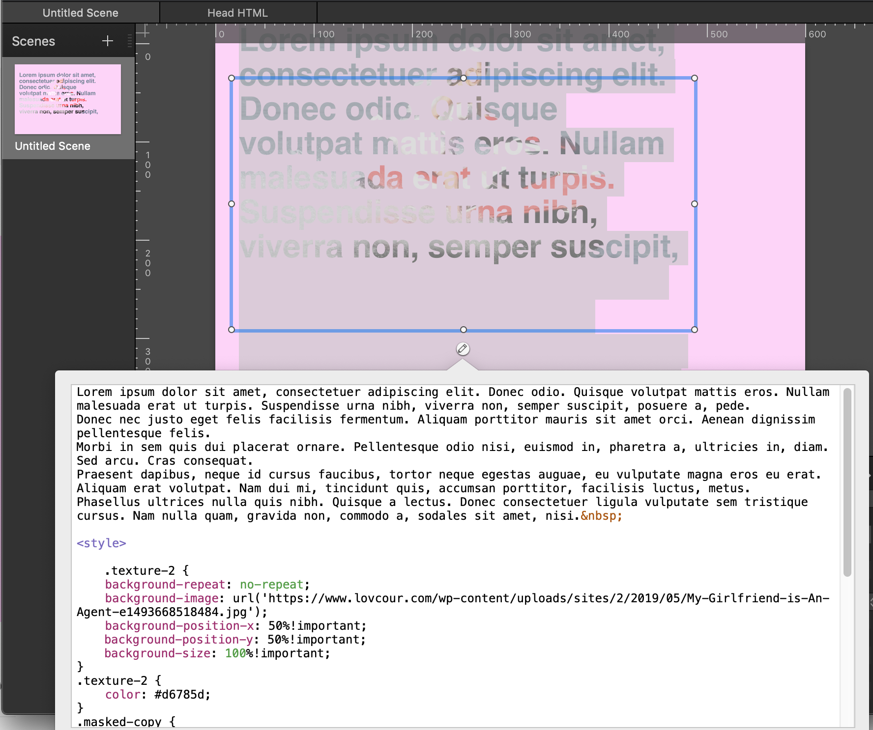
 <style>

 .texture-2 {
 background-repeat: no-repeat;
 background-image: url('https://www.lovcour.com/wp-content/uploads/sites/2/2019/05/My-Girlfriend-is-An-Agent-e1493668518484.jpg');
 background-position-x: 50%!important;
 background-position-y: 50%!important;
 background-size: 100%!important;
 }
 .texture-2 {
 color: #d6785d;
 }
 .masked-copy {
 -webkit-background-clip: text;
 color: transparent !important;
 }
 .masked-copy {
 padding-bottom: 12px;
 margin-bottom: -12px;
 }

</style>Hi @Daniel,
I was out for several days, and sorry for later response and thanks so much for detailed support information.
I had a check with your two demo hype documents:
and I found there is a same issue in these two hype documents:
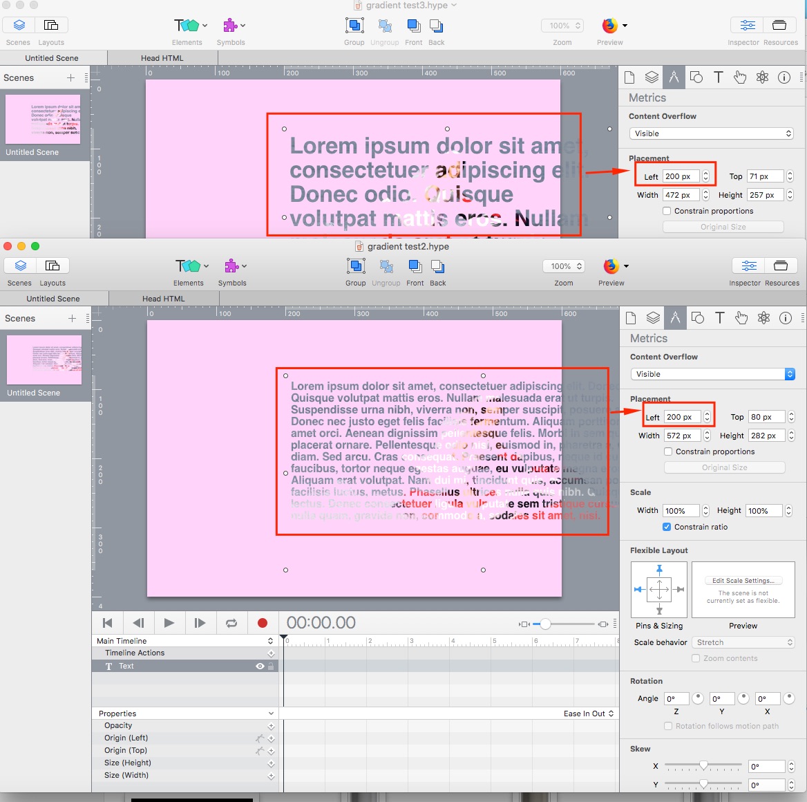
If the placement left=200+, the text content will invisible In Firefox preview mode:
I did not change any other setting, so I am not sure what is the reason, and It would be appreciated if you could have a check.
gradient test2.hype.zip (35.3 KB)
gradient test3.hype.zip (33.2 KB)
Thanks
If you check ‘Position with CSS left/top’ this issue will be fixed.
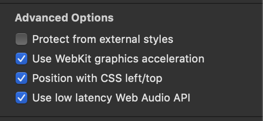
I don’t really understand why, but likely has something to do with how Firefox is calculating the element position.
Great thanks.
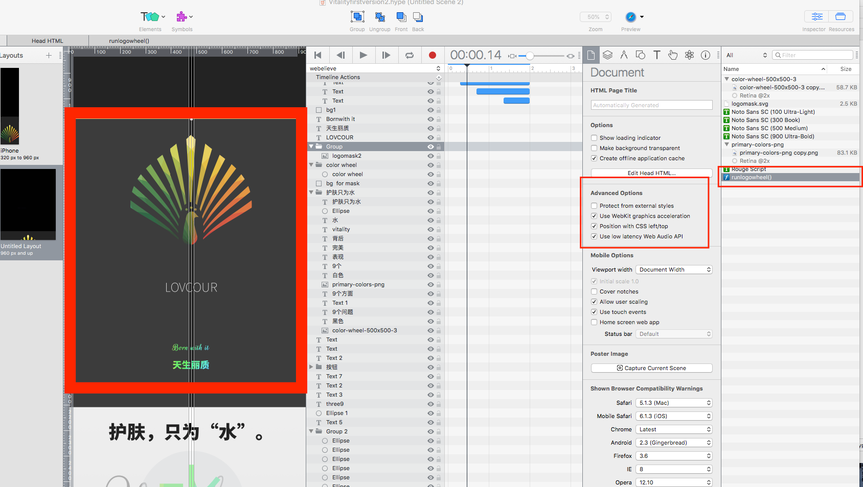
Also, I found the option of “Protect from external styles” has to be unchecked. any potential conflict between this gradient design and that option?
Here is my first test page, and I switch the embed mode to ‘iframe’ in the panel for the Hype Animations plugin.
https://www.lovcour.com/homenew/water_9a/
Again, thanks so much for your support.
Hi @Daniel,
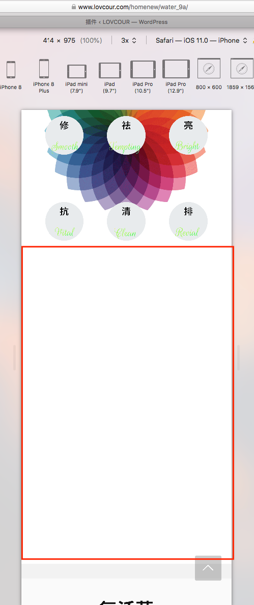
I just found two issues.
1# There is a scroll time javascript as the following screenshot:
but it does not running at https://www.lovcour.com/homenew/water_9a/
what might be the reason caused it not work please?
2# You will found there is large empty gap in mobile mode:
Here is my document:
Vitalityfirstversion2.hype.zip (204.4 KB)
Thanks