Hi Wolfgang!
Sorry it has taken so long to get back to this post but I just now finished a major project and have had the time to follow through.
Your question is one I’m not familiar with and so I’ve had to dive into the literature, which has taken a while - there is a lot there… what follows is a summary based on reading not experience.
First let’s cover the most obvious solution - if You have a solid color for a background you’re already in business - simply sandwich the text between the background and an overlying transparency mask. Probably this mask needs to be triggered at a certain point in the page scroll and not a full time feature (i.e. every element fades out as it approaches the top~bottom).
So You will need to set a trigger based on the “Scroll”: http://www.w3schools.com/jsref/event_onscroll.asp
As the page approaches a certain point - the text You wish to fade is close to the top, bottom - or wherever - You activate the transparency mask. As Trey mentions in his post above You can style~size this mask to fit your needs, it does not need to be the width of the page.
BUT if your background is not a uniform color - a gradient, repeating pattern, image, etc. we need to take a different approach…
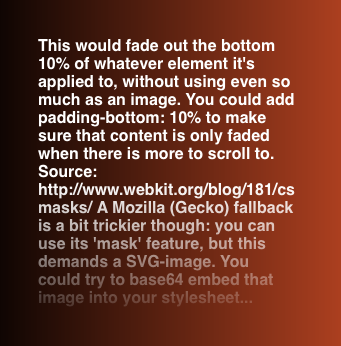
The solution to this different approach is so simple - but there is a “fly in the ointment”. Apparently Mozilla (Firefox) did not get the memo about using CSS transparency masks - a solution that has been around for years.
The base transparency mask code (used in the following screen shot):
#textFade {
-webkit-mask-image: -webkit-gradient(linear, left 50%, left bottom, from(rgba(0,0,0,1)), to(rgba(0,0,0,0)));
}
To animate and size the mask will take additional code - bit it is very straightforward
Example (not related to the above image):
.demo-1 .page-view .project:nth-child(even).hide {
	-webkit-mask: url(../img/nature-sprite.png);
	mask: url(../img/nature-sprite.png);
	-webkit-mask-size: 2300% 100%;
	mask-size: 2300% 100%;
	-webkit-animation: mask-play 1.4s steps(22) forwards;
	animation: mask-play 1.4s steps(22) forwards;
}
The above code gives You an idea of what’s possible using Safari, Chrome, & Opera - nice, clean and simple.
Mozilla is apparently mired in a continuing sclerosis. You need to use its masking feature with an SVG image. Another layer of obfuscation to what should be a straightforward operation.
Here is an example of the using CSS transparency masking & Mozilla fallback (SVG mask). You will need to dig here - but that’s how You learn - right?!
https://tympanus.net/codrops/2016/09/29/transition-effect-with-css-masks/
Bibliography (there’s way more, simply Google “CSS transparency masks”):