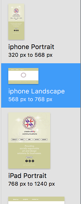
The layout that matches iPhone 6 portrait is fluid or fixed width?
Under 768 pixels all layouts should be elastic (variable width layout)
Hi Michelangelo,
Is there a sample template to have the user click on a previous and next button to to back to and advance images manually? A zip file would be appreciated. They have helped in the past.
I’m not sure to iunderstant the question. An image gallery?
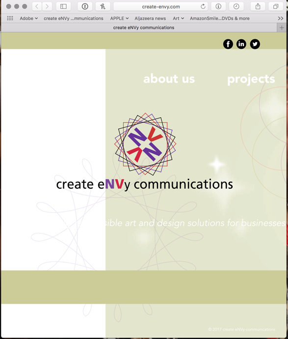
Hello. I am attaching two screenshots of my website. The first is the breakpoints of the 5 layouts I am using. The second is of my desktop window when I drag it so it is smaller. Can you advise me on the correct breakpoint to make my website work smoothly? Thanks.
Have You seen @h_classen's recent post? It may be what You are looking for...
Thanks. But without javascript? Just using settings and breakpoints in hype?
Hi Neomi!
I've reviewed this thread and it would seem your solution is in here - I can't think of any more information to add - except... maybe...
There is one thread with this post by @michelangelo who has a simple set-up (no javascript, just CSS):
The above post takes the approach of reducing the number of layouts needed. The online demo in the post appears to do an effective job (I have not used it). Perhaps this concept might work in your situation.
Here is the post's associated Hype file:3X2.hypetemplate.zip (532.0 KB)
This helps. Thank you. As a general rule, are the break points the width if the orientation if portrait and the height if the orientation is landscape?
The breakpoints are always the width using Hype’s settings.

