Responsive Layout not working

Breakpoint on phone layout is set for 320. On computer 1240, when viewing on computer, it shows up as the phone layout. When I add the phone layout, it shows up on the computer screen in safari.

Here is a zipped file:
envy_test.hype.zip (132.5 KB)

It looks like that section is scrollable, but it is a bit tight on phones. I recommend not using the ‘height’ scale checkbox in the document inspector so you can use the natural height of your Hype document instead of relying on a scrolling text box.

Thanks. But this didn’t work. Something is going on with the breakpoint values.

I recommend looking at the Layouts pane which indicates the sizes at which it will be displayed. The first iPhone layout will be from 320px to 1240px (effectively everything until 1240px). If you want the computer layout to show up before 1240px then you’ll need to adjust that breakpoint.

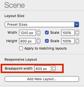
in Hype you can adjust the breakpoint between layouts

envy_test_improved.hype.zip (134.5 KB)

I improved a lot of things in your project, you must fix some issues in the drop navigation and some other things

1 Like