Pinning to the bottom

Is there a way to pin a symbol to the bottom of the page on the mobile version where it doesn't get cutoff on a wider phone?
I don't want to group everything and do the zoom thing because then the either the items will shrink to fit the phone and have a space on the right or the items will stretch unproportionally to fill the screen.
I tried pinning it to the bottom but it gets cutoff on some of the different sized phones. I tried pinning it to the top but then it shows up in the middle of the page on some phones. Please help. Thanks in advance.

What I'm doing with the app version of A Book About Hype seems very similar to what you're trying to do.

The objects inside don't zoom. They just stay in their corners. To hide the title, as there's not enough space at smaller sizes, I use media queries to change the display of the element.

      @media screen and (max-width: 550px) {
           .title {
                display: none !important;
           }
      }

The "Flexible Layout" setting looks like this...

hype-book-flexible-layout-menu

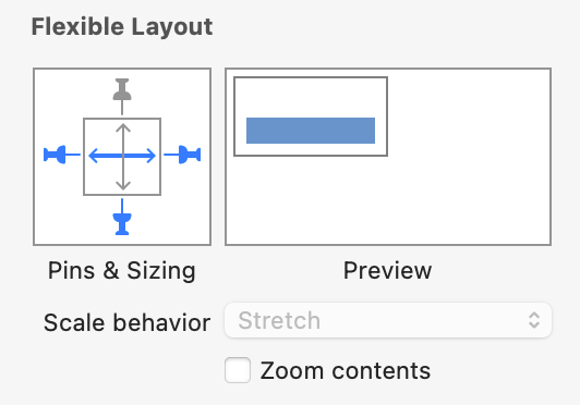
The bar expands to fill the space. Elements can be hidden if there's not enough space.

There's the "Book" template, which is a close example to this...
https://photics.com/free-template-tuesday-14-tumult-hype-book/

I gotta get going, but maybe that info helps.

1 Like

Thanks, will see if I can get it to work. Cheers.

That is pretty awesome! I was able to get my bottom pinned items to work the same as the sample here but I am not sure how the scrolling action is initiated? Is that in the html or in the javascript funtions? Sorry newbie to coding here.

Found it. got it all working. Thanks for the sample!!

3 Likes