Not fitting in Wordpress Elementor column

I exported an OAM widget and imported with the plugin Tumult Hype Animations (version 1.8.2) into my Wordpress site built with Elementor. I put the shortcode in the Elementor shortcode widget. The Hype animation is set at 1000 pixels with horizontal scale selected at 100%. I used the div minheight400 as mentioned in an article on this forum. The animation appears but extends beyond the width of the column as in included screenshot. Can anyone help me figure out how to make the display of the animation fit in the column and be responsive? Is it a problem that the graphics fill the full 1000 pixel width of the canvas I set up? They are all Hype generated objects.

I don't think so. If your Hype project is responsive, then the problem is probably with the plugin. I had to use some trickery to get my projects to stay inside the box... and scale nice.

  1. Use iFrame instead of div
  2. Style the iFrame
  3. Add another container around the iFrame
  4. Style the container

My shortcode looks like this...

<div class="hype-box-16x9">[hypeanimations_anim id="1"]</div>

...and I had to add CSS to style both elements.

Normally, I just place the iFrame right on the page. It's old school, but a lot less hassle for me.

<div class="hype-box-16x9">
    <iframe class="hype-iframe" src="/files/templates/darkmode" allowfullscreen="allowfullscreen"></iframe>
</div>

Here's an example of the manual iFrame...

...and here's an example of the plugin way...

Heh, maybe one day I'll get around to finishing that game. Anyway, the point is that both are quite similar to the website visitor's perspective. It's up to what you prefer and your situation. If you are opting to use the plugin, the dual-container and CSS method might work for you — it works for me.

1 Like

Thank you for your advice! How do I check to make sure my Hype project is responsive? I have this setup.

Well, you got one of the parts right. Your document is set to scale. But did you set the elements to be flexible too? (Shown bottom right)

The lazy way is to chuck all the elements in a group and then set the group to scale (shrink to fit). That’s horrible for accessibility though. You might need layouts with breakpoints, which is shown in the picture. The elements flex a little, in each layout, to gently react to the different screen sizes — but adding layouts can add a lot of work.

Based on your design, the trick is to keep the circles in approximately the same location. The middle one is easy. Just click the left, right and top pins. The left one, click the top and left pins. The right one, click the top and right pins. The line would be pinned and set to flex. That might be the look you’re looking for.

It’s a bit of work, but can look really smooth when done.

So I have to set the pins for every element in the animation?

Hey... it is improving! https://weengage4health.life/test/

Yeah, pretty much — and for each layout. It's very tedious, but the results can be quite nice...

...if you're using Safari, try entering responsive design mode...

...or whatever's the equivalent in your web browser — simply changing the width of the window can work. On the Hype book page, you can see how the elements react to the changing window size. That's what you'd need to add to your project to get a similar effect.

That's good. Welcome to web development. You solve one problem and find two more. HA HA!

Pinning works best in two locations — in the middle or on the sides. Your #1 and #3 circles are not in those spots, so the positioning gets messed up in the smaller sizes.

That's where breakpoints / layouts help.

Oh boy! I definitely need a different layout for phone!

I created an iphone layout that is set to display at 320-800 px. It has only the first circle in it. The desktop display is set for above 800. It looks right on the Safari development mode preview. But when I put it on my page at https://weengage4health.life/test/, it shows only the phone mode (single circle.) It is the third version of the animation on the page. Any idea why this is happening?

Which one are we looking at here? I see three different areas of navigation.

Maybe only try it with one Hype project on the page. (I don’t know if that matters, but it’s a way to isolate the problem.)

So, now just the one I created phone view for is on the page. You can see in the safari test it displays correctly for a computer screen:

Mike, I was looking for a link to buy your book, but I don’t see it. :wink:

Soon!

I'm waiting for the proof copy.

If you want to be notified when the book is available, heart this post.

It looks like you're using something called "Elementor", which seems to be restricting the width of the box. There appears to be an empty column on the right side. So, I'm not sure what's up with that. But basically, this doesn't seem like a Hype problem, it's probably a WordPress Theme issue or block placement issue.

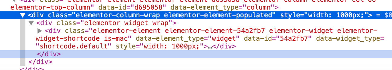
Locally, I modified the HTML code, changing two elements to 1000 pixels wide — which is beyond the breakpoint. Once I moved the window a little bit to refresh the view, the three circles of your design appeared. So, this seems to be a WordPress issue.

But before I created the alternate phone layout, everything showed fine with the same elementor setup. I don’t understand that.

I’m not sure either, but I’d probably try experimenting. What happens if you put the block in a different region? What happens if you load the older project? Looking at the previous screenshot, it looks like the project was getting clipped. In your first screenshot, the third circle is not shown.

There’s the “SEPA” block on the right side. That reduces the space, no? Maybe the breakpoints are too wide. Maybe that blue block goes in a different spot for this page. That would give you more space to work.

This stuff is tricky. That’s why I wrote a book… no responsive design to worry about. HA HA! (But surprisingly, that has its own set of trouble.)