How can I make responsive in deferent pages I have built header on the Scens through persistent symbols that I have, now on deferent devices does not work currently and pining does not work either! Help
symbols can have responsive settings like any other element … if you’re asking this …
or do you mean that appearance differs from devices to tests on desktopbrowsers?
you may provide a simplified hypefile showing your case, it’s always best practise …
Thank you I just fixed I had to create several p-symbols for different size because on one when you change I changes other layout sizes as well!
Hi,
I’m using persistent symbols as sort of navigation menu with many animations. I’ve build the mobile version and I’m trying to figure out how to use the persistents symbols I’ve made in larger layouts (ipad, desktop). I’ve understood the properties of persistent symbols are responsive from outside the symbol. What about the elements inside the persistent symbols ? Is there a way to make the persistent symbol content responsive ?
See my simplified doc above. In the scene “galerie-1” I’ve just added a new layout. The persistent symbol of navigation is much smaller…
I hope my explanation is understandable…
If you use flexible layout, you can setup elements to individually change their positioning within. It is similar to the group. The trick is that you need the persistent symbol element itself to have flexible layout setup, and you then need any parent groups also setup - basically flexible layout settings need to go all the way down as it would with a normal group. That said, sometimes it is easier to use “zoom contents” on the persistent symbol element.
Just as a reminder, the symbol element itself is different in each layout/scene, so they can have their own settings. However items inside are all identical due to the nature of being a symbol.
Ok thanks I’m going to work on that. And also find out how zoom content works.
Have a nice day!
1 Like
You can make "elastic" Persistent Symbols with extra CSS code
in this example the header is just one symbol but you are able to change the length in each layout independently.
You don't need to open the symbol to do it.
The bad thing is that you lose the preview correspondence. so, be careful 
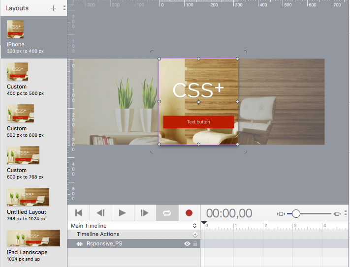
responsive_PS.hype.zip (412.1 KB)
Thank you @michelangelo ,
in my case I think the solution is this:
with Hype, if you want to build a responsive header, you must not think in some persistent symbol at the top of the page with responsive width.
Instead, you have to build one persistent symbol which will be sticked left/top, then one persistent symbol which will be right/top (and one at the center if you need it). In this way, when you use another layout, all symbols will stay at their position, and you have still the posibility to make them bigger or smaller with the zoom content.
1 Like
In an header, background and the content must be centered, any other kind of content can be sticked left/top,
Yes I know, but for my header (you can see it through simplified project or link to my page in post above or in the picture below) I wanted the title of the site sticked top/left, a link to info page sticked top right, then a sub-header with commands left and right. First I made a persistent symbol as header with left and right inside it. But this was wrong because in wider layouts I would need to create another persistent symbol to have the same positions. So I decided yesterday to divide my persistent symbols left/right so when I will go to another layout they will stay left/right and the only think I would need is to zoom content to make them bigger. May be this explanation will help somebody in the future  see the picture:
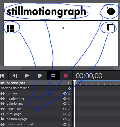
1 Like
Some considerations on the SCALE tool. In responsie desight this is useful for titles and some images only because in hype you can't set a variable height of the layout.
Moreover each scaled element engages the rendering of the page and some contenties become blurry.
So, if you have titles and buttons it works:)
in my example you can enlarge the image via CSS or align elements, this is an alternative