I was wondering if anyone out there has any rendering issues when exporting the project.
For example when drawing a button on the canvas it appears correct on desktop width window BUT when viewing on a mobile device it suddenly reduces its veritcal height , the same thing is happening to other elements on screen but not all of them.
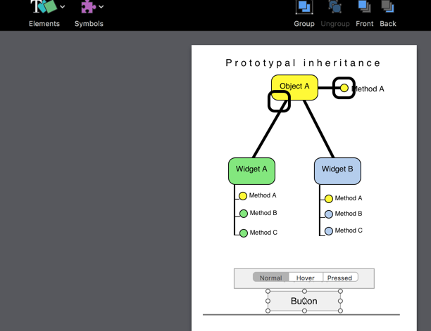
Here is the image drawn correctly - although work in progress, notice that the button appears correct and the black rectangle around Method A
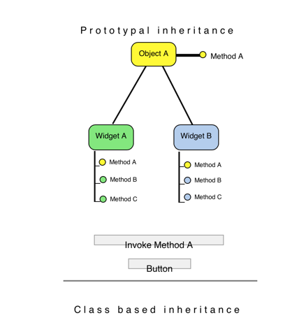
Now look at the same scene rendered on an iphone, the button is wrong and so is the black rectangle around Method A
All that was done to create this was drawing the element onto the screen (once selected) from the dropdown palette, and then immediately exporting. Plus other elements seems to be shifting their coords when displayed on smaller device.
Does anyone have the same problems?
I brought Hype specifically to create these types of things to be displayed across multiple screen sizes, but on my first attempt I cant even get a project to render with consistency across 2 screen sizes.
My guess is that this is a difference in how browser are interpreting ‘line-height’. Try this:
Select groups of text that are the same font size
Switch to the Typography Inspector
Adjust the ‘line-height’ slider and use a line-height value that places the text at the ideal vertical position.
Let me know if this improves the position on the other device.
The device is an iphone 6s plus, however, I have little more info.
When I actually use reflect it renders perfectly however once deployed on to a site via ftp - thats when things start messing up ( when site is viewed on phone )
I have inspected the actual element and found the issue but have no idea why its happening
If you notice the highlighted element ( the button div ) has a height of 15px however within Hype the button height is 29px - the default given when element is drawn onto canvas.
Now we're getting somewhere! Ok this is a known issue related to a box-sizing property. If you have CSS included on the page forcefully setting a 'box-sizing' property to every element, you can add this to the head of your document somewhere to override it:
Sorry for making this so long winded - I should have been more explicit from the start, but the whole Hype thing is brand new and I didnt know if I was doing something wrong!!!
When I finish my work I will post you a link so you can see what I did, Im using interactive diagrams for normally boring technical prose.
