I have try to scale the height via scene inspector but it make the height scale depend on browser’s height regardless of height&width ratio.
How can I make like this image?
Hi @Franksuper
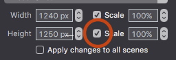
If you only check the width scale box
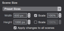
and then any object on the scene you adjust it’s Flexible Layout like this:
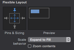
You will get something similar to your image.
You may need to add another layout with a shrink to fit so that you can accommodate the smaller screen size.
Here is a link showing what I mean
Thank so much for DBear but I afraid it isn’t same as I think.

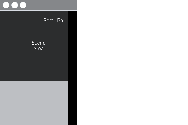
I your link when I adjust the width of browser the scrollbar still same size.
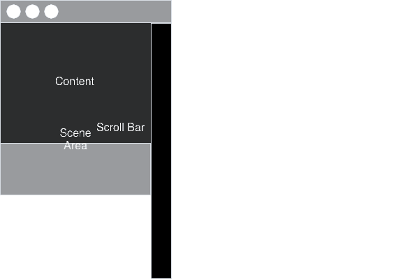
This is more image that show what I want.
Ps. I want to make the scene’s height be scaled by the browser width.
get the width of the window onsceneload and window onresize events.
be sure to know which height belongs to which height.
set the height of the current scene and of the hypedocument to this size.
take this (2.6 MB) it’s a mess, but setting layoutheight (scene, document) depending on window width using fix ratio
The other option which Hans has already mentioned is to manipulate the scene’s height by using the browser’s resize height. Can be a messy.
Can I ask why you would want this effect?
Thank so much for h_classen it very very work.
To DBear because I want to make fullscreen wide flexible website by using only Hype.
I'm not sure to understand the question, however, in hype (with standard tools) you can not change the height of the document. The height is fixed for each layout. For this reason you can not use variable height elements.
Note: You can use the vertical scale, but this is not a soluiton