Help to improve designs!

I have been using Hype since 2014. I developed about 100 movies and iBook chapters (with Hype widgets) to help bachelor and master students to better understand some ‘difficult’ IT topics. The students are/were very enthusiastic about the projects.

At the end of this academic year one of my bachelor students made the suggestion to update my files and to give my movies a more ‘professional’ look. I believe he is right (students always are…).

Since the movie is too large to include with this topic, I published an example of one of my movies on YouTube (https://youtu.be/MTCCHlE7WFU). I will use the new YouTube channel IT4STUDENTS to publish all my projects after updating. I really feel bad when I compare my ‘basic’ work with the splendid projects published on this forum.

Is there anybody who can give me some great ideas to professionalize my projects?

1 Like
  • Don't overuse transitions. Just deliver the data.
  • Don't use videos for text. Maybe use Hype itself if the information is meant to be interactive.
  • It looks like you're just making a presentation, maybe use one of the themes in Keynote or Powerpoint.

There's lots of other software that could be used to make a presentation more interesting...

...or just search...

1 Like

Thank you so much. I use videos to avoid distribution problems. I chose Hype because of the animation capabilities.

The comments made by my students are similar to your remarks.

Some comments from my students:

  • too much text on one scene;
  • transition between scenes is too fast (you have to pause the movie to read all text on one scene);
  • simple animations (not very attractive);
  • movies must be short and attractive.

From a graphical design perspective, a little bit can also go a long way. I’m not one to say be super trendy to the point of distraction, but using “modern” styling can leave a more credible impression sometimes. I’d recommend:

  • Using a grid system incorporating margins, especially around the edges
  • Remove border lines and instead use whitespace or background boxes to delimit sections
  • Choose color schemes and text colors based on a modern palette; you can find lots of these on sites like https://coolors.co/browser/latest/1

Ultimately the content matters most though :slight_smile:.

1 Like

This is extremely left-brained stuff and intended for straight memorization. It is like taking a syringe of data, sticking it into someone’s head and pumping it in. As this is just text and numbers, it might as well be a printed book.

Although most people in your field are left-brained by nature, it would be a good idea to teach to the right-brain as well. This is the strength of Hype. Try coming up with graphic representations of the concepts and then alternate between the animated graphics and the hard information. This would make it more interesting and less tiring.

As for the layouts, use your eye like a camera. Think about various things that make you feel good when you look at them – websites. posters, advertisements, and even paintings or still photos. Break down what you see into elements and basic shapes. Check out the space around them and consider their position in the X and Y axes. Think of a composition like a game of chutes and ladders – how the designer purposely leads your eye on a journey around the page so that you end up looking at the most important element.

Also try breaking the information into digestible chunks. Don’t jam things together, but add a little “air” between them. For example, one object / text group conveys the principle, another object / text group provides an example or extrapolates. Give the learner the visual space to pause for a moment and assimilate what you are saying.

Also consider the principles of journalism when composing your page: What is happening, how is it happening and why is it happening, and put this in a logical order.

As an educator, start with laying out the basics, then teach the content, then summarize, and make sure you don’t lose anyone along the way.

4 Likes

@Furutan

Nicely said! :ok_hand:

I don’t want to get too arty here, but I’m going to anyway because the visual flow of composition is important for all hype users.

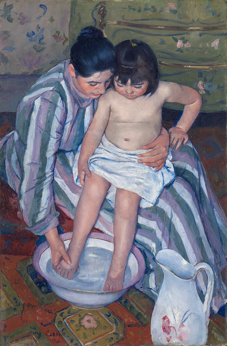
Take a look at Mary Cassat’s “The Child’s Bath” (1893) (An American painter who was a key figure in the French art circles of her day.)

What you see first in the composition is dead center. The child’s hand and leg point to the mother’s hand as it washes the foot. The bowl swings your eye around the other leg, upwards to the elbow, across the two faces, then it follows the stripes on the mother’s arm back down to the hand again.

As you continue to explore, the angle of the white towel and the direction of the striped on the dress take you directly to the pitcher. Your eye follows the oval shape of the pitcher down, around, and up to the lip, which leads the eye to take a dive from the lip of the pitcher, into the bowl and back into the circle of motion.

As this is going on, a number of messages are being delivered: the closeness of the two faces has meaning. The round and round motion conveys a rhythm like a scrubbing motion, which represents the action being depicted.

One more hidden thing is that the motion is counter-clockwise. This is because most people are right-handed and we tend to feel more comfortable with things rotating clockwise than counter-clockwise. This was done because it makes you pause for a microsecond at each waypoint and you have to work at it. This is extremely intelligent. Taking is as nothing more than a painting, it is pretty ordinary, but when you think of the extreme sophistication of the composition, this is how a painter might be defined as a genius.

This is one of the most authoritative examples of this that I know of.

To me, an understanding of the directive nature of visual composition is key to a good composition in motion graphics. When designing, it is a good idea to provide a visual sequence so that the intent of the composition is expressed in more ways than by a number of moving objects, each of which is fighting for attention. Start by focusing attention on the noun (the visual title or starting point of your message for that scene). Then lead the eye to the verb (the main action / the fun part). Then finish with the adjective. (Are you into Haiku? Same principle.) You want the viewer to focus on the meat - the second stage – then have time to take it in, then finish with a bang that either underscores the main message or extrapolates, such as adding something unexpected and pithy. It is like the punchline of a great joke.

Motion graphics is as much about conveyance as message.

@jonathan @Furutan @TYancy @Photics

Thank you so much for all comments.

I also asked a 1st year bachelor IT student (18 years) to give me some advice. Three days ago I started to develop a new movie based on his suggestions. After reading your comments, I feel the video seems childish. I still have too much text (it is part of an IT course) with some animations to simulate what a professor illustrates on a black- or whiteboard during colleges. Yes, Photics it is still a presentation that also can be done in Keynote or Powerpoint. Yes, Furutan I am left-brained. My right-brain is not working so well. I am not a great designer. I only try to bring images and (basic) animations into my colleges to clarify some (difficult) topics. And the students can watch it over and over again.

But, you all gave me some great ideas. I will try to do some rework of the new movie based on the remarks from Furutan and TYancy. It will not yet be a work of art but I will try to stimulate my right-brain during the design process.

I let you know when I publish the new movie on YouTube. All comments are highly appreciated.

I’m right there with you, but coming from the opposite direction. I’ve got the right-brain stuff totally nailed but the left-brained stuff, such as scripting (at least with JS) is a battle for me.

I am a Mac Design guy, but I do like the Material design theme/pattern by Google.

https://material.io/guidelines/

Very clean, modern, very flexible. You can also build upon it with simple adjustments to your palette and your typography.

Always remember that the Content and the theme should work hand in glove and the theme should not be the dominant player on your stage.

The color section alone is a great primer for anyone starting out in design.
https://material.io/guidelines/style/color.html

Simple shapes colors clean readable type for the device, consistent transitions and you have a winner :slight_smile:

Thanks Nick, great documentation!