I have a lot of trouble when laying out blocks of text on hype documents because when I preview them in Firefox the fonts display differently to all other browsers. Here’s an example:
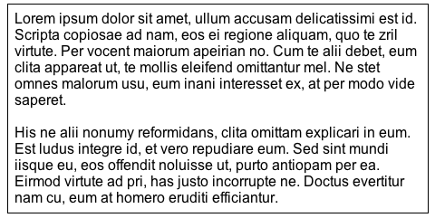
Here is a simple block of text in Arial with a box around it:
When I view the web page, everything looks as expected in Safari:
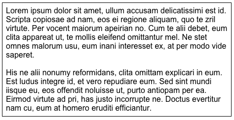
…and in Chrome:
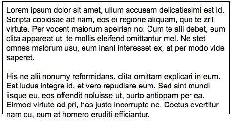
But when I view it in Firefox, it looks like this:
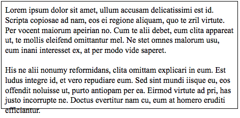
This happens for many standard fonts. Here is the same block using Times New Roman:
Some fonts seem to display smaller rather than larger (eg. Courier and Helvetica) and a couple of them display the same size. But it is always Firefox that has the issue, this never happens on any other browser.
This is really frustrating as it makes it almost impossible to lay out websites so that they look the same across all browsers. If I leave enough space for the larger text on Firefox I’m left with ugly gaps on other browsers, whereas if it looks right on the other browsers I often get text overlaps on Firefox.
Is this just a fundamental problem with Firefox or can this issue be avoided somehow?
You can set an explicit line height (this is a CSS property) in the Typography inspector. Instead of using 'normal' (no value set), Firefox will likely behave better if you set a value yourself.
This what @h_classen's suggests, but without code.