Hello,
Note: I believe this to be an issue with padding and margins set in the WordPress page this document has been embedded. I will return when I have an answer. No need to look at the remaining message. Thanks!
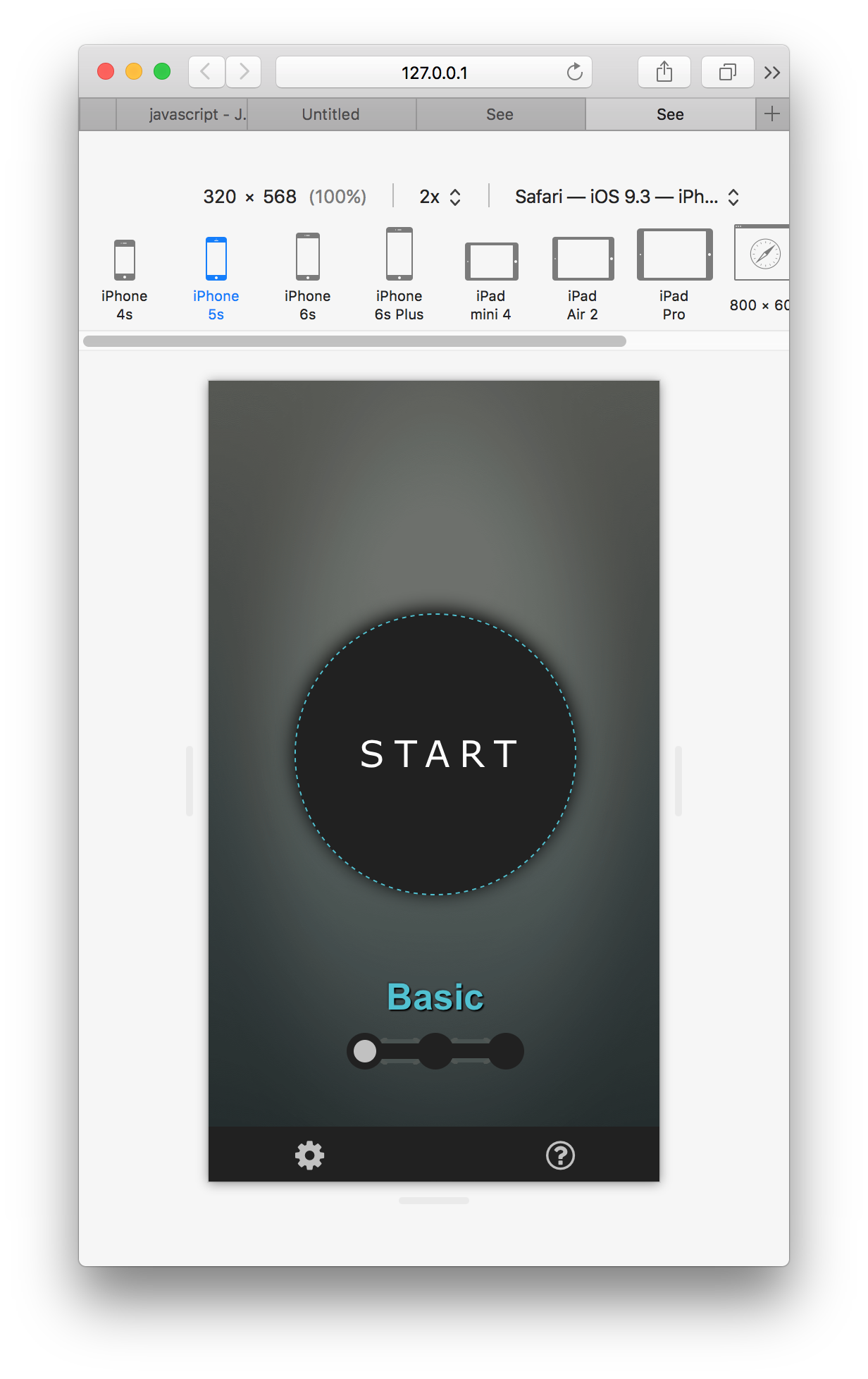
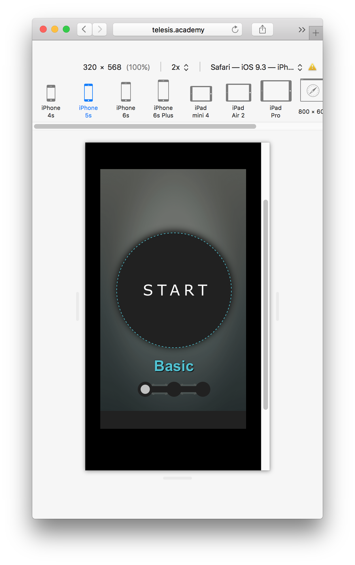
I am using Safari’s Responsive Design Mode to verify that my scenes scale properly across iPhone 5s thru 6s Plus. When previewing the scenes locally, the scenes look as they should. When viewing the document on a live site, the scenes aren’t scaled properly (portion of the scene is cutoff on the lowest resolution device) AND scroll bars appear across all devices. I’ve included screenshots. Could someone provide advice on how to get my live site to match what’s showing up locally? Thank you!