I’m using Hype to update the announcements (new&events) widget in my organization’s LMS (D2L).
Initially I was running into a problem getting the”carousel” to loop. But then received feedback that the content “i-framed” into the widget was not responsive.
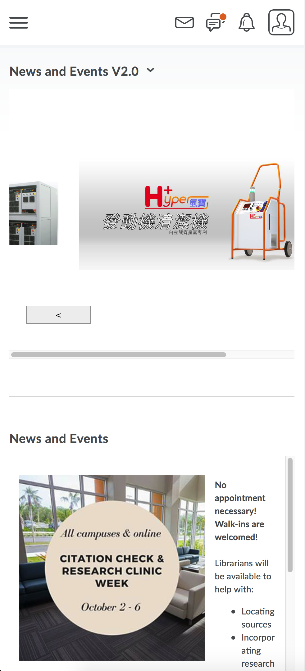
So then I just changed the carousel images to dissolve, and then loop at the end of the timeline.
The D2L widget’s dimensions are 760x432. My Hype document is 700x400.
Is there a way to make the Hype content responsive to the D2L widget when scaling the browser window?
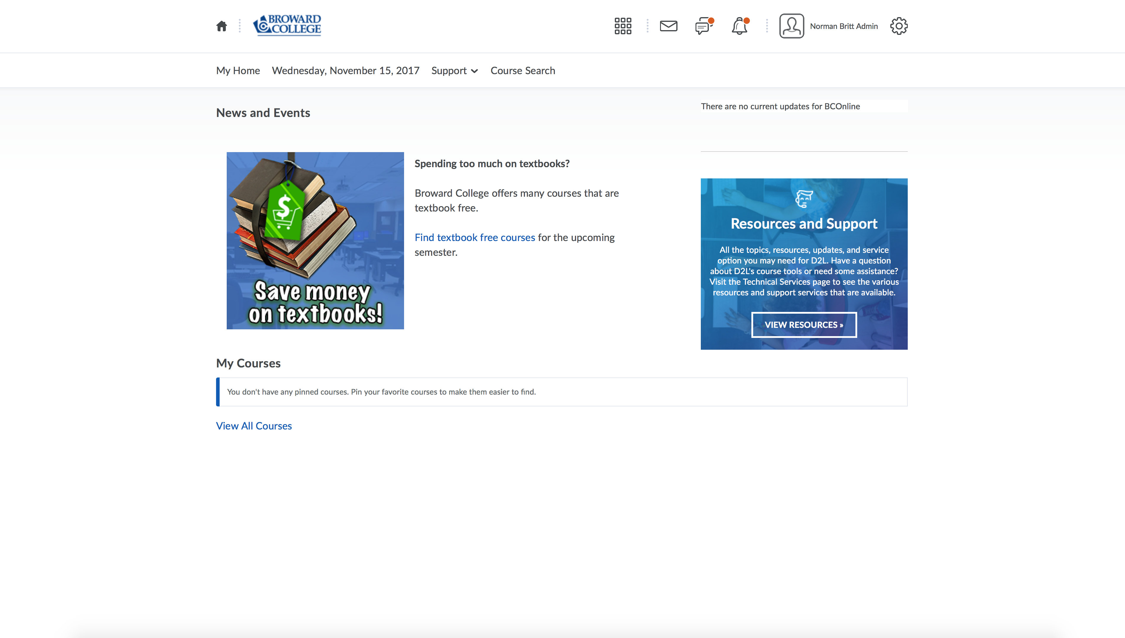
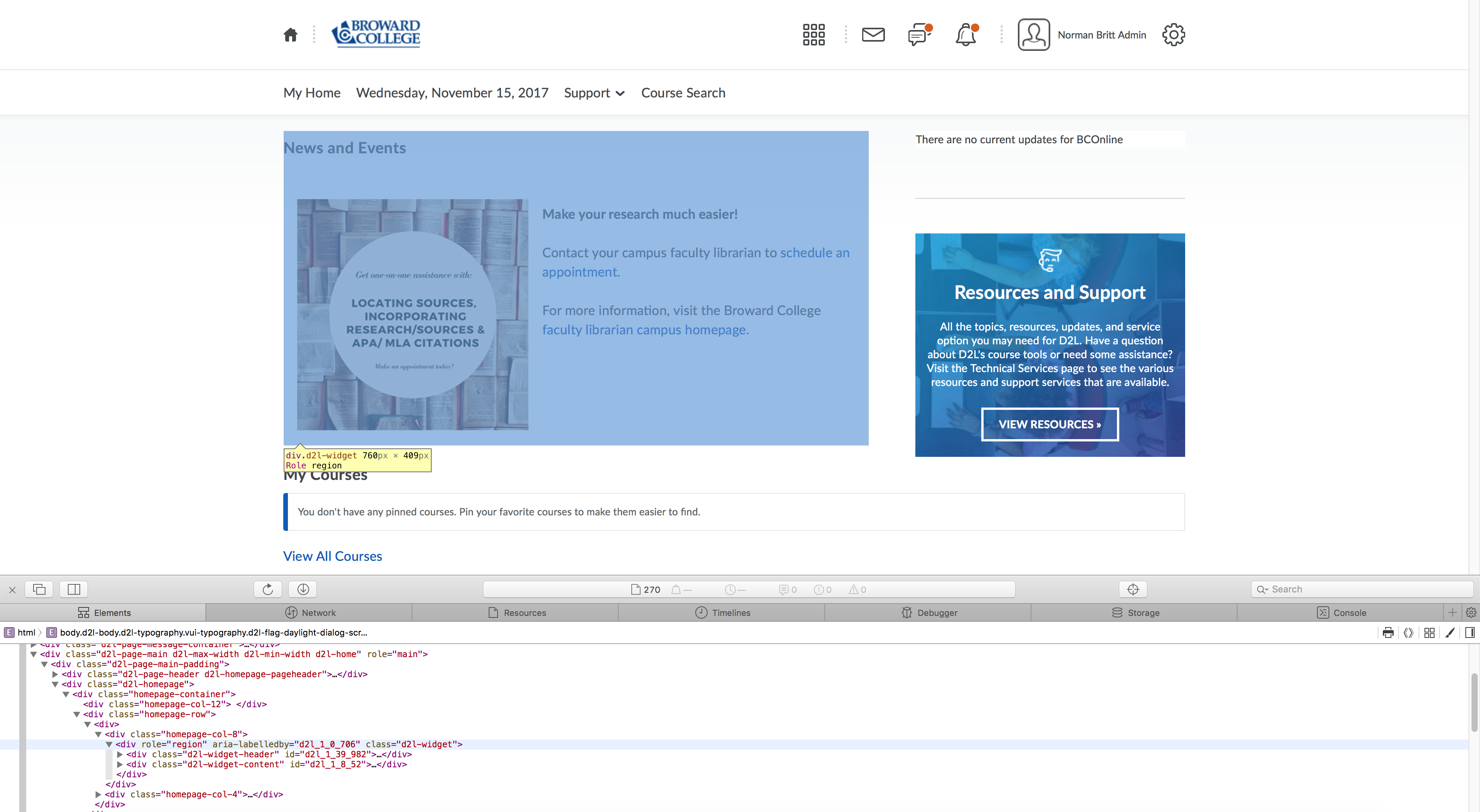
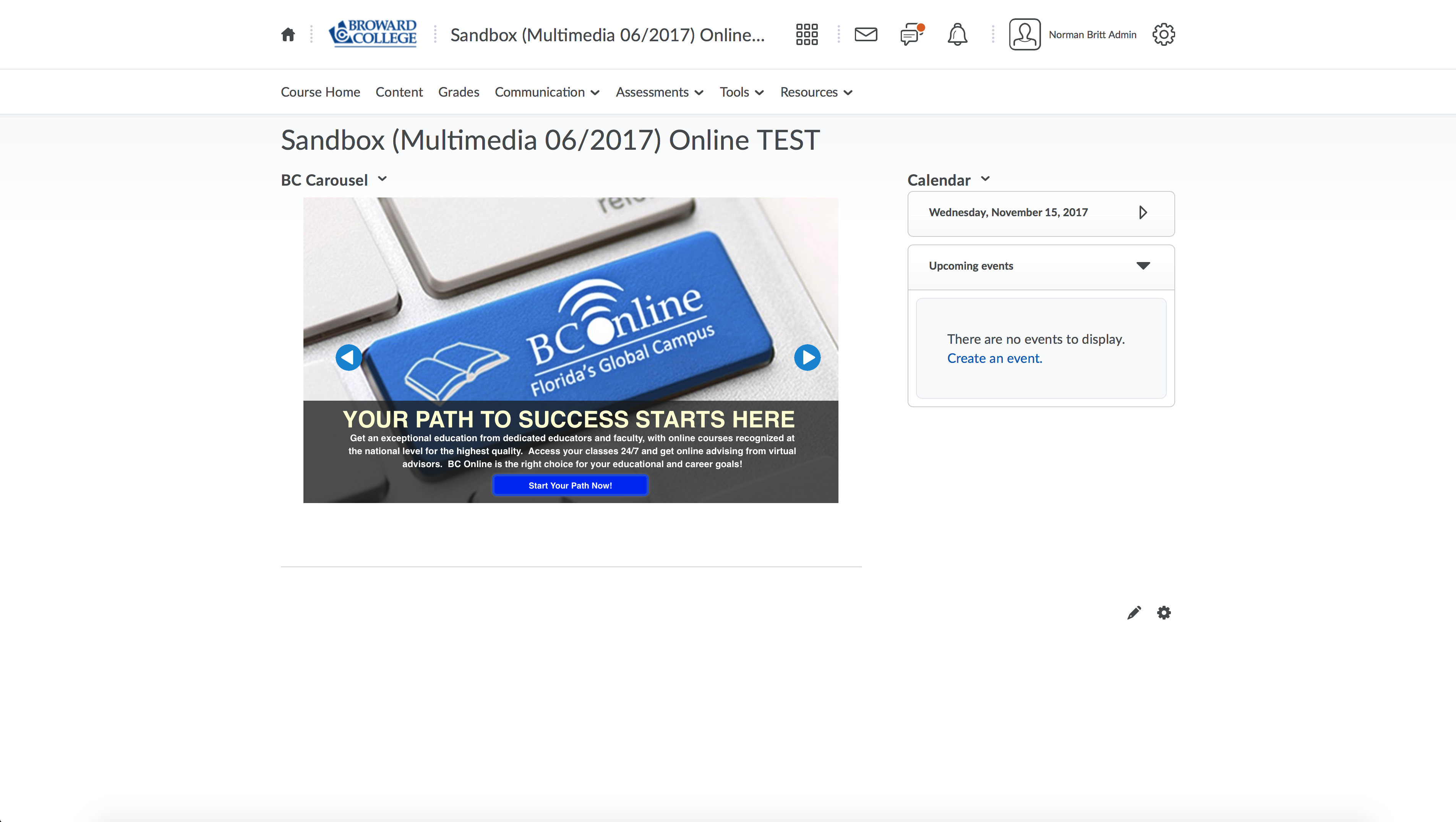
I’ve provided the Hype document I created, along with snapshots of the current announcement widget; as well as the widget with my Hype doucment embedded (along with snaps from the Safai developer window). The current D2L announcement widget is responsive; as visible in the image labeled “scaledbrowser_D2Lwidget(hypetest).jpg.”
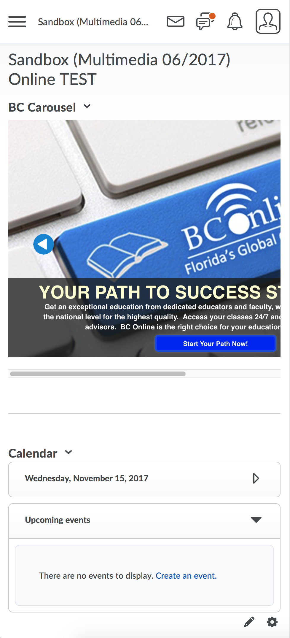
So I found another thread that offered a very clever suggestion which worked! Now when I preview the Hype document in my browser, it scales proportionally (see attached file).
I use D2L Brightspace too and I wonder if the answer lies in adding more Layouts, where you can then readjust the layout of your content to match the dimensions of the given Layout you are working on.
In this screenshot you’ll notice there are layouts for:
iPhone
iPad portrait
iPad landscape
Desktop
I haven’t played with Layouts yet but it’s on my ‘Must Do’ list
Hopefully someone else with more experience in Layouts will chime in.
Let me know how you go.