Hi all,
Im struggling a bit with responsive. I was trying to achieve the following:
Create at 990x540 as a max size and scale downwards until a breakpoint is reached and then change layout for portrait iPhone. All of this needs to work in an iframe that contains my navigation between pages. My approach has been to group the main layout and scale it - I haven't started yet on the smaller portrait layout yet.
When I preview the output the elements off the canvas are appearing - how do I hide these?
Given that all this has to appear in an iframe with the page navigation, how do I keep things centred?
I have attached screens from my settings, an image showing the hidden elements appearing and the overall embedding of a 990x540 output in the iframe. Any help would be appreciated
Thanks Michael
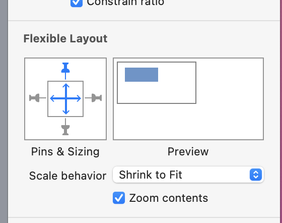
The general way would be to create a containing group that is set to have the Content Overflow in the Metrics Inspector set to Hidden.
Generally you will need to have flexible layout settings turned on for that group (and probably do not use "zoom contents" but this may be dependent on what you are doing).
Ah OK there were a couple of other issues:
If I add content overflow to hidden it works BUT I had to change the groups bounding box to the canvas size. Grouping elements created a box that was larger than the canvas which also created the problem
what breakpoint value should i use for the smallest size - Hype has a 320 wide phone or 375?
As soon as i add a second layout, the main layout stops scaling?
1.hype.zip (148.8 KB)
breakpoint is the start for a layout. i'd guess that you like the bigger layout down to 600 or so, otherwise the scaling down does not make sense
the fixed size I work at means it fits in iPads and desktops and its only a phone that the problem exists so I assume if I create a breakpoint at 375 that should cover all bases