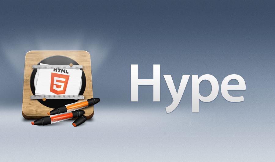
What does the Hype logo mean?
What do you see when you look at the Hype logo?
What does it tell you when you look at it?
I was always curious about this. Now I’ll just be asking all of you.
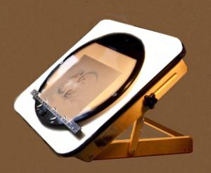
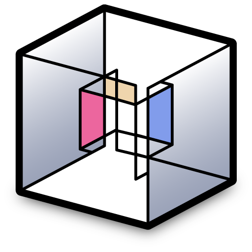
For me, I don’t know what I am looking at. A wooden, base with two rulers on the top and bottom end of a white canvas that could show something, as it is positioned between two timelines?
And there are days I think I am looking at a monitor base with two rails to push it forward and backward.
I would never want to discourage artistic or creative work, so you are welcome to attempt dramatic or refinement changes to the icon. But do note for a large variety of reasons we may not be able to accept unsolicited work, even if we do like it! (And the bar is pretty high with the current icon, imho)
Here’s a video if you want to see someone using a light board in action:
Take that righty’s! Pure Talent. @bendora, I’d actually use a 3d app to create below and animate whats currently there in addition I’d remove the HTML 5 logo and put 4 in the center
Thats what I would’ve done. I think tumult should have a logo remake competision where users get to re-create a logo and tumult would pick three finalist and a final one to be used for Hype 4.
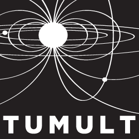
It got me startet now. What about the Tumult Logo. In my own and the German Language it means going against the stream. Does this have the same meaning?
The star or sun with rays for that matter feels like a rising sun. Is this indication correct?
I am trying to truly identify myself in order to see it all visualize in my head.
I've never heard it described as such, but basically yes. The best analogous definition that kept in my head was "the chaos associated with revolution," which is the context in which it is usually used. Mitt Romney in the US 2012 election used it 3 times in a debate once and it drove a nice spike to our website traffic as folks were trying to learn its meaning .
Essentially! The logo is a bit of a happy accident that started in trying to show an explosion (going along the theme of revolution) but morphed into the idea of it being "the sunrise of a new world" from the end of star trek II. In some ways it was never fully complete; this was a prototype design but ended up working pretty well.
There was another concept I wanted, which was somehow using the funny shapes created from particle colliders. The first attempt proved that it was probably too detailed for strong branding, and we tried this one that was simpler and had more symmetrical field lines but had a similar issue:
...20 years and I'm still not happy with a Photics logo.
The new Affinity Designer logo works because modern design is flat. It's trendy, like miniskirts. Skeuomorphism... that's like shoulder pads on women in the 80s.
So I started to animate with the options at hand. But I am not yet satisfied. I also didn’t change the logo or have a feeling where the Logo should go to or look like. It is pretty hard now knowing its meaning.
But this where I am on a Sunday after 2 hours.
Not sure where the background jumped like that. I thought I got rid of all keyframes.
The thing I discovered:
can’t record Physics to a gif or mp4, have to screencast.
UPDATE I will add the video after I got clearance from the Tumult Team.
The logo is the logo. Consistency in a logo is fundamental to brand building. Generally, if there is a change, it is to reflect a change in the company / product. It is not about current trends, fashions, or styles, or about what the image represents to one demographic or another.
If you want to include a note about the logo on an About page, why not. As for changing the logo, it should only be done for a specific reason; a reason that is fundamental to the business of doing business.
I’ve been designing logos for over thirty years, including logos associated with very high profile companies, including logos recognized by many Hype users. My two cents is this: don’t change the logo unless it will have a notable impact on driving revenue.


