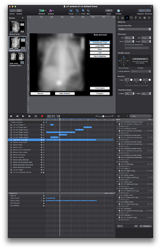
Hype 3 one-window interface

Rolling a floating palette into the main window appears to be the fashion, but it serves only one specific type of user situation - an easygoing situation in which the user has only one monitor. It is one in which tight deadlines and speed are not a major issue.

For people with only one monitor and who like to work full screen it’s not a problem, but for people with a lot of screen real estate and / or a dual monitor rig, this is a huge headache. If you need to resize the window, you don’t need the palettes following you around the screen. You want to have them in one place on the screen and not moving around.

Frankly, being limited to a tabbed palette is tough enough, but to have it permanently attached to the main window is absolutist. I am a pro who knows his software inside and out, including all of Adobe Master Collection. I use my second monitor for palettes. I know exactly where every palette, every tool and every button, slider and field is, and I can go to any of these things instantly. I do not have to click on tabs to find what I want. It is always there in the same place right down to the pixel.

The business of digging through tabs is by definition a compromise, not a feature.

I used to be a major fan of Apple Motion - intellectually, I still am, as the interface (as it originally was) was absolutely brilliant. But then Apple in its wisdom decided that all Motion users work off a single-monitor system. They took all the tool palettes and compressed them into a tabbed palette and then they slammed it into the main window.

To have been able to fly through things, to go directly to the button, slider or whatever instantly and with barely looking – the way it used to be with Motion – this allowed the user to scream through production. But when they went to the new configuration it suddenly felt like I had my elbows strapped rigidly to my sides. Everything (except the preview window) was compressed down into a single monitor. My second monitor was wasted and with everything i did, I first had to click on a tab before I could access the tool or control. it took an extra step with nearly everything I did, knocking my productivity down, killing the inspiration and turning it into a drudge.

In many ways, Motion is light years ahead of After Effects but I gave up on the struggling, goodbye to the claustrophobia, and after several years of using Motion like mad, I switched back to After Effects. Other than checking on the rare new releases of Motion to see if the palette thing has changed, I have never looked back. It’s a shame. I really liked that app.

As for Hype 3, I’ve been a big fan since day one, even with the tabbed palette approach, but I totally hate this all-in-one interface. I would rather not switch to Edge Animate, but Hype’s new, constricted interface is a huge slam to my way of working. Please create the option to break the tools and resources palette out of the stage / timeline window so that I can place the tools in one location and leave them there.

This app is now officially called Hype Pro. From my perspective, a pro app such as Adobe’s creative apps, offers the option to work like a pro. A non-pro app is a single-window app. For those of us who work in a breakneck, high-pressure environment and who need to get the work out the door as quick as possible (and sometimes with deadlines of only an hour or less) we need an interface that does not inhibit speed and productivity. Give us the option to achieve this. Let those of us who need it have the option dockable palettes.

12 Likes

Couldn’t agree more, I’ve been asking for this since day one, to have to use a tabbed palette is so slow. I go backwards and forwards through the palettes all day long. It can’t be a hard job to give us pro users the option of dragging the individual pallets out of the tabbed layout.

I’ve just downloaded the Pro version after reading it had a customisable UI and now find I’m stuck with the single window and all I can do is move the menus about within that.

I’ve loved Hype from day 1 and the support is about the best from any company I’ve used in 20 years but this feels like a step back. I also use two monitors, the main one being 4K now so have a ton of screen space and like to have my menus where I want them not stuck to the main window.

If I have two or three animations open at once in different places on the screen I now have the menu jumping about every time I swap between them which is just daft.

PLEASE allow the menus to be untapped and separate from scene window!

1 Like

I remember that there used to be an ongoing patent thing between Macromedia and Adobe about docking palettes. Adobe bought Macromedia and solved the issue instantly.

I don’t know if this is why Hype uses the tabbed approach. I am aware of a number of apps that also go with the docking palette approach - companies that I doubt are paying any license fees to Adobe.

I like Hype. A lot. I do not want to resent Jonathan or anyone else because of this degradation of the interface, but while the new features are truly great, the consolidated interface thing is a step backwards and it really stings.

The advice that I follow in UI design, and the advice I give to others in UI design is this:

  • Programmers are left brained, while most creatives are right brained. Make
    sure that what you design appeals to and is able to serve both left- and right-brain thinkers.
  • Just because you can do something, this doesn’t mean you should.
  • Don’t sacrifice function purely for the sake of form.
  • The only type of one-size-fits-all app is a consumer app.
  • Don’t use the term “Pro” simply to designate a version that has more features than another version. Make sure that the Pro version has a pro interface, not just pro features.

I think the world of Johathan, Ryan and everyone else. I just don’t like straight-jacket interfaces.

2 Likes

Take a look at Serif’s Affinity Designer and their Photo Beta. They have a unified window too, but in their Window menu there’s a a Separated Mode option - and that breaks the palettes and toolbars apart from the document window, so it looks more like a traditional Mac app, and you can use more than one screen.

1 Like

I work with multiple monitors often. I love that Hype Pro allows configurable UI, but it’s all bound to the confines of the single window. Let’s move beyond that!

1 Like

We totally hear you! Our original design was to allow the panes to be undocked into separate windows. Due to some technical hurdles, we had to punt on it for this release, but it has been part of the plan all along. The single window mode isn’t a mode we chose out of interface absolutism, but one out of a pragmatic decision to ship.

10 Likes

Cannot put a finger on why, but it seems that I do far more dragging and resizing with Hype3 than previous versions. A couple dozen times per hour at least and I am always searching for a menu. It maybe that I use flat screen tv’s and there seems to be no way to set display sizes to match perfectly. In any case a STRONG vote for tear off menus.

1 Like

I do have to say that with Apple being obsessed with change for the sake of change, I would not want to be in any developers shoes these days. They are constantly messing with the interface, must have some severe ADHD people in Apple OS interface development. I know ADHD, i have it. :slight_smile:

1 Like

It is what it is. I’m not all that bothered. With companies like Apple and Adobe, just about everything is so complex that it is common for great features (and the reasons for them) to be ignored by the endless stream of young tunnel-visioned geniuses who are intent on pushing new cool stuff and the great things (and tons of the small things) are eliminated due to this.
Tumult is not a huge whopper of an outfit overrun with hundreds of hot shots. There is only so much that can be accomplished with a given size of staff and man hours available and if you don’t release, you don’t eat. I have no doubt that Tumult takes customer feedback seriously. Things will be sorted out in the next release.

1 Like

Don’t get me wrong Tumult Hype support is absolutely the best. It’s never been a question of that. I think your description of the “young geniuses” at Apple is the issue.

Ken

1 Like

Completely agree.
Will upgrade to PRO the instant this happens.

1 Like

Why wait? It’s not that expensive and it is well worth it.

1 Like

You’re right.
Made the upgrade… ah, beautiful :slight_smile:

However, it would still be nice to pull the interface apart and better use my 3x 27" screens.
Also, there is a bug that cripples Timeline Actions when expanding my ‘Widescreen Layout’ across two monitors. Timeline actions are not editable when this happens. You can not edit nor add - and need to squish the interface back down to one monitor to get Timeline Actions to work.

1 Like

I'd be curious if anyone else hits this. If it does, please reference this thread and use Help > Report an Issue and include your logs. I'm a one-window guy myself and this doesn't happen using an Airplay display on 10.10.4.

I can edit ‘Widescreen Layout’ over my MacBook Retina screen and my Lenovo monitor (portrait mode) although I’m still on 10.8.5.

I’d like to see palettes available separately too.
Would be nice to see a future version of Hype with preset layouts for multiple monitors.
(Similar to Adobe product Final Cut Pro, etc.)
As mentioned above I use a MacBook Retina with a Lenovo monitor in *portrait mode.
*I work with a lot of long web pages and can’t be bothered scrolling :wink:

Hmm, just playing around with using Hype in the Portait monitor and here’s what it looks like.
(Note: Image blurred on purpose.)

2 Likes

Do you have a Public Roadmap somewhere? It would be nice to follow along your team progress, knowing what to expect for the next version (like Serif does for Affinity Designer and Photo…). Thanks! :smile:

1 Like

Sorry, we don’t publicize our roadmap.

Must admit, not a big fan of the tabs… am finding myself constantly jumping between tabs to get something done. A simple solution is to have it automatically switch to the correct tab when selecting an element on the stage. For example, if I select a shape it makes sense to view the “Element” tab where I can edit things like size, color e.t.c If I select text on the stage it makes sense to view the “Typography” tab.

Right now I have to manually select the tabs I want. Be much better if these tabs where intelligently selected for me based on my actions.

1 Like

if you work fast i can imagine that can get quite frustrating as it would keep flashing back and forward every 2 seconds , I think a better solution would be for a way to dock some of them so that they’re visible on the same screen
This may help you, i bound all the tabs to the F keys so F1 to F6 are the tabs on the right

1 Like