I’d love to see the attributes box we got now on elements also on the document and scene panel. Maybe on the very bottom so it’s not interfering with what people know… Any chances?
3 Likes
straight forward 

1 Like
Thanks - I’ve filed this. Are there some specific cases you’ve had in mind where you need this? (it will help me prioritize).
When playing around with scenes (transitions etc.) or multiple documents (as widgets) on can offer the user to set values on scene and documents.
1 Like
Okay, now I got some time to answer properly. My thinking was and still is that Hype has some amazing potential for extensions. The first step in evaluating this future is having parameters on components. Now we have the attributes panel and that is a welcome addition. The potential goes beyond elements as scenes and the hype document itself become building blocks to use. I think Hype ScenePage has much potential and I want to develop it further (hopefully convincing users and you) with it on the mentioned modularity. WordPress is another great example of Hype being a widget as attributes (or better Dataset) are settings that can be used for a shortcode (Gutenberg Block) or scripts by programmers to integrate Hype in their CMS.
I am also bringing back the dataset discussion. I appreciate the attributes panel but it’s a compromise as it gives complexity and full access to the HTML elements. W3C doesn’t actually allow arbitrary values on HTML elements, so one has to know what one is doing. Also there is the camelCase naming Schema that is different in JS and the dataset-attribute (data-hello-world <=> dataset.helloWorld). I am not at all asking to role back attributes but to add a default view of the simple dataset with the camelCase validation (regular users) and add a little dropdown or button to switch to an advanced full attribute view (pro users).
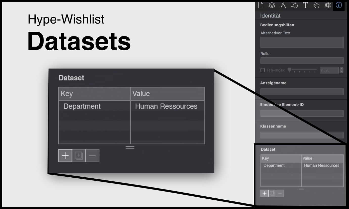
I’d love your feedback on this…
To make some room on the document panel the compatibility settings could maybe be collapsed or reduced to a button that forwards to preferences or a popup. I’d be curios on the actual usage as I know that I hardly use them… meaning I value feedback but not often change settings there.
Thanks for the elaboration. As you surmised, the main difficulty is one in UI – it would be clunky to have this in three places. (This is an instance where a contextual inspector can be better!) This of course leads to a question of utility vs. clutter. On a utility standpoint, additional attributes on elements is doubly useful because you can use attribute missing from Hype, like poster on a video element along with any custom data- attributes. However on the scene/document level I can only think that data- attributes are useful. Which means you’ll have code supporting them, and writing the code to do a .setAttribute isn’t too hard in the On Scene Load handler/an easy way to get at the scene element.
My feeling: it's not hard for the "programmer" type but for the "designer" type that just wants to use stuff it is.
The UI side could be solved with design. It comes down to customizability of the interface. It is in that sense also a bit of personal taste. I personally consider the very spacious placement of the compatibility settings "clutter". Others might not. Have you ever thought about collapsible accordions in general so people can "hide/collapse" stuff they don't use as much?
Or the attribute/dataset panel on scenes and document panels could also be behind a button.
As said I'd would want to roll back attributes as I consider it a pro user feature. It just be nice to be able to switch that panel to a dataset view (or better the other way around) have it in dataset mode and have it switchable to attributes for the pro's.
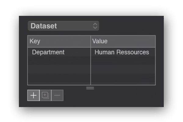
This could be a possibility to switch between dataset view and attributes. Other design are also possible.
Yes, but I have many thoughts on this and how it should be avoided as much as possible  . There are so many inspectors out there that require a million clicks to get to anything!
I will consider this... another area where I'd like to still have customizability is in adding custom CSS properties as well so maybe there's a good way to show all three. But, I do think users need to know what they are doing with this panel regardless; I could see hiding the "data-" portion of the attribute leading to confusion as we learn the hard way it is often better to expose the underlying HTML than abstract it away.
and @jonathan
There are so many inspectors out there that require a million clicks to get to anything!
I use DxO's PhotoLab which has a more involved set-up and tool set~Inspectors than Hype does. It is a great interface - easy to get to everything and customize to your workflow.
Below ("DXO_Interface.mp4") is a demo of the DxO PhotoLab interface with accordions & sub-accordions. There also is a "grab bag" category ("Essentials") that You can place your frequently used tools in. You can also create your own palettes for specialized tasks - great use of space and it has the same set up as Hype in that these panels are a fixed width.
That’s the idea … but two levels of accordion depths! isn’t that a bit much… 

Until some one wants something else added. 
Yeah keep things simple and please priorise my wishes
2 Likes
Yeah… you got it. I am gone tune down posting frequency.

Yes - it might appear to be that way - but it is actually a very efficient UI. DxO PhotoLab (formerly DxO Optics Pro) is a world class Camera Raw demosiac app aimed at professional photographers... who have absolutely no problem voicing their (very strongly held) opinions about almost anything. These guys have used a lot of different Camera Raw apps and they are unanimous about the ease of use and customization of the PhotoLab interface... and there are a plethora of settings - yet are customizable for easy access.
As I have experienced this PhotoLab interface - the amount of clicking is minimized. The secondary accordion level has proven helpful and not a hindrance.
The ability to customize the layout to a user's workflow is a key feature in this accordion concept. It is all about efficiency, reducing the number of clicks.
This (app & document level) customization also includes holding open the secondary accordions - even when the document is closed they maintain their state (until they are closed by the user). There actually isn't much click, click, clicking once You have things set the way You like.
The great aspect about accordion design is of course they only take up the space needed. The current Hype "Panel" interface takes up a given amount of real estate whether it is fully occupied or not, which has led, IMO, to placing various groupings together even if they are not an exact match, so to use the fixed panel areas efficiently and keep the number of tabs down.
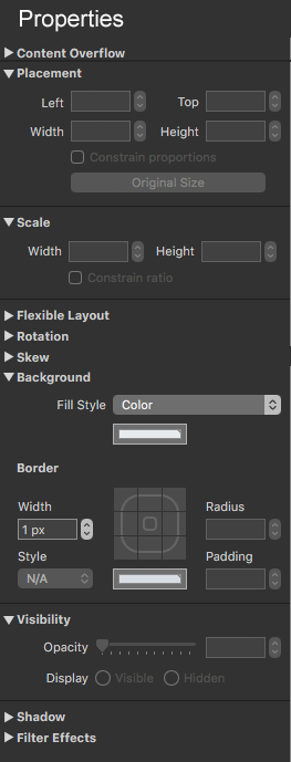
One example of the efficient use of this accordion concept would be the "Metrics" & "Element" panels, which are by far my most frequently used ones. To me they belong together in a "Properties" panel. I often have to flip back and forth between the panels as I am creating an element. For instance changing the padding in the "Elements" panel means I have to flip back to the Metrics panel to make an adjustment in height or width.
However, I do not use "Drop Shadow" & "Filter Effects" that much in the "Element" panel.
I do not use "Flexible Layout" nearly as much as the other settings in the "Metrics" panel and "Skew" hardly at all.
Again, this is just my typical use pattern - everyone's will no doubt vary - which of course is the point of the ability to customize the interface.
Given my foregoing descriptions this is how I would bring the "Metrics" & "Element" panels together in one column. Reducing my click count by a significant number on a large project.
A rough concept...
Customized to my frequently used properties - in one panel = reduced clicking
1 Like
For me the problem with accordions and drop-downs is the info is not glanceable.
And effectively slows you down as you have to click through them.
1 Like
I can definitely see how that inspector can be good for an image-based workflow.
One of the differences in an app like Hype is that inspector items aren’t really based on personal workflows, but more element-based ones. That is to say, for certain elements based on their content may benefit from showing different inspectors. Even an image that is a label may be very different than an image that is a photograph.
Adobe apps like Photoshop have taken an interesting approach for “favorites,” with the top options toolbar being redundant in some ways but providing for quick contextual access.
v4 did take a bit of a departure in many ways with the vector tools inspector always being shown while in vector edit/pencil modes. I don’t know what this necessarily means for the future of Hype’s inspector, but I thought I’d just point out that even though the inspector seems the same, there have been changes. I haven’t gotten any negative feedback on the way this is handled, so I’m assuming that the vector tools are presented in a useful manner.
1 Like
I personally see the vector tools as a special case but they do not in my opinion depart from the overall way the inspectors work.
My perspective is;
Since a vector is not visible until you go into edit. Where you see the vector and the applicable vector inspector. Until then ( out of edit ) you are seeing an element and it’s inspectors
1 Like