What breakpoints for all devices?

Hi,

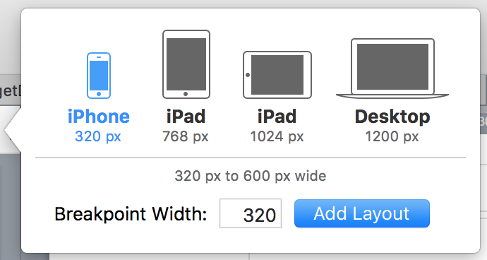
Has anyone encountered a breakpoint chart that carters for all devices?

  • iPad, iPad Pro incl. retina display
  • iPhone
  • Android devices

Ideally I would like to target these devices, if they are on a laptop/desktop then to open another window which I am creating a script for using the type of OS on the users device.

Regards

Our recommendation is to make breakpoints for the default sizes in the “Add Layout” popover:

When used in conjunction with Flexible Layouts this usually is a good balance between not too many layouts and nicely sizing between devices.

OK thanks Jonathan,

For anyone who would like to test the apps there is a free browser that emulates the majority of devices:

Available for Windows and Mac.

Thanks!