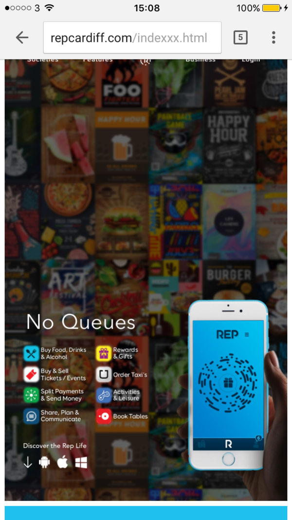
With this line, the layout works across mobiles, tablets and desktops, but the hype animations are laggy (see the navigation bar) and the ‘Discover’ button doesn’t work.
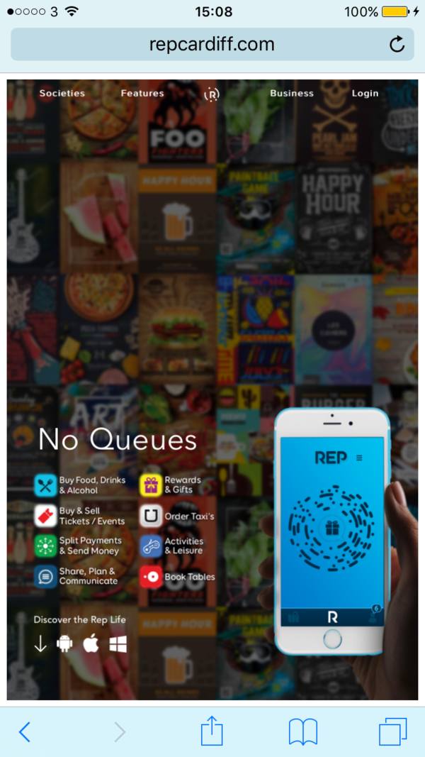
Without this line, the website layout is completely wrong, but there is no lag and the button works fine.
At first I assumed since scaling is off, it would use the first layout but it instead uses 750px to 1400px, even though the iPhone is 375px wide. Why is this the layout and not the first one or the correct one.
Hmm… on an iPhone 6/6s/7, device width should be 375px if you are in a portrait orientation. I’m not sure why it would load 750px if you have a smaller one in that case. If you don’t use the viewport setting, then the width is 960px which is what you would be seeing.
Either way, the main issue was actually the button functionality. Why is it that the button that scrolls down works without the viewport but stops working with the viewport?
No, device width used in Mobile Safari is 375px on those phones (where a pixel is really a “point”, or a @2x pixel). When I view on mobile, I do appear to get the correct layout on both links.
To clarify, the bottom one is the correct layout that you want, right? And that is showing up okay, but the discover button is not working?
I’d need a zip of your .hype to investigate more, but my guess would be that you’re doing the scroll via some sort of Javascript, and that may be referencing something different when in your mobile layout. The mobile layout is a different scene, and has different elements/etc, so it could be that you’re not performing the scroll correctly (this is my best guess).
I would suspect the problem is that you have multiple elements with the id of “jump” in each scene (in the “jump” element). IDs need to be unique, so each layout should have its own element for going down on the page. There also might be easier ways to do this as well.
I’ve tried everything I can and I still can’t get it to work. I’ve duplicated and renamed JS files, objects and ID’s. I’ve even gone as far as deleting the corresponding files for the bigger layouts and only leaving the mobile layout, and it still doesn’t work.
Is there a solution you have, or possible the easier way you mentioned.
It’d be useful if you could send a package with all your .hype documents and files you are using to compose this, since there’s a lot of different files.
The easiest way that doesn’t have a smooth scrolling effect is to just use the javascript window.scrollTo() function.