Unscrollable and cut areas when browser width is changed (flexible layout issue=

Hi there, i came across one big issue i cannot solve on my own. I have a scene with viewports 320, 480, 768, 1024 and 1200+. The “width” scale field is checked. And the whole content of the scene is grouped and the flexible layout is set to shrink to fit, zoom contents and height/width is actived in the flexible layout sub menu.

The issue: when i change the width of the browser before reaching the next breakpoint, let’s say i stop while the width is 400px the lower parts are cut out and cannot be scrolled too. IS there a fix for that? I am truly going bananas…

Cheers

HI @Zoran can you provide an example online?

it’s www.3opahv.de i’ll send you over the guest-access via PM. much thanks in advance.

There is an important distinction to be done in web projects with hype.

in Hype it cannot use items with variable height. Strange but true :frowning:

Solution:
1: remove "scale" and add variable width to all elements.
2: use elements with fixed height and boxes with "hidden overflow" for all images with responsive behavior.

Example:
http://www.hypedocks.com/downloads/fluid-columns-kit/
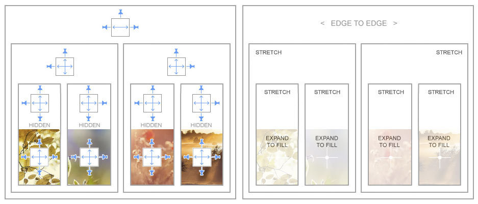
Thanks a lot Michaelangelo. I will try that one out and see if it will work out.

Hi Guys,

I have downloaded the above template.

If I change the text area to auto scroll it doesn’t allow me to scroll.

What am I doing wrong please?

Cheers
Steve Warby

Hi @classic12 probably depend on the setting in your probjects
in this template you can find a css style for the scroll.