There is an important distinction to be done in web projects with hype.
in Hype it cannot use items with variable height. Strange but true 
Solution:
1: remove "scale" and add variable width to all elements.
2: use elements with fixed height and boxes with "hidden overflow" for all images with responsive behavior.
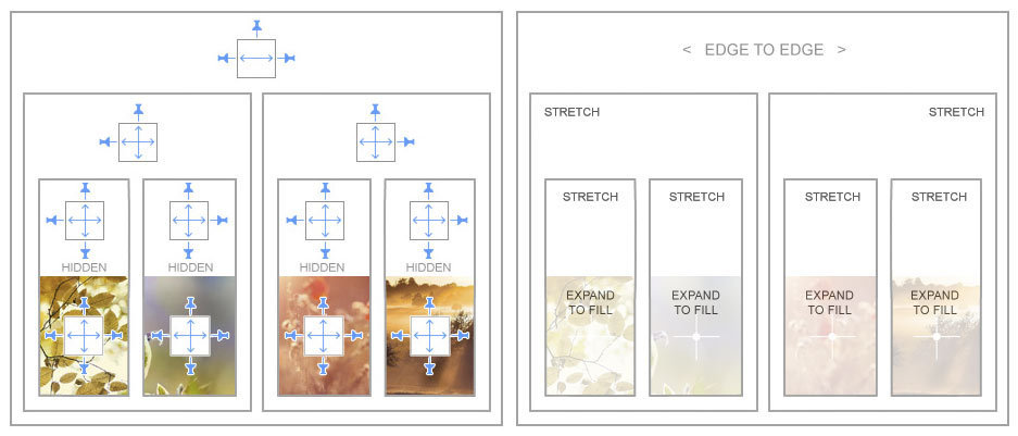
Example:
http://www.hypedocks.com/downloads/fluid-columns-kit/