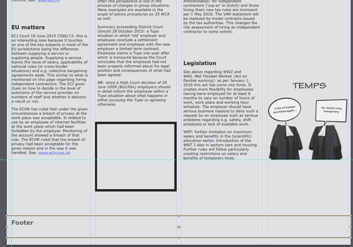
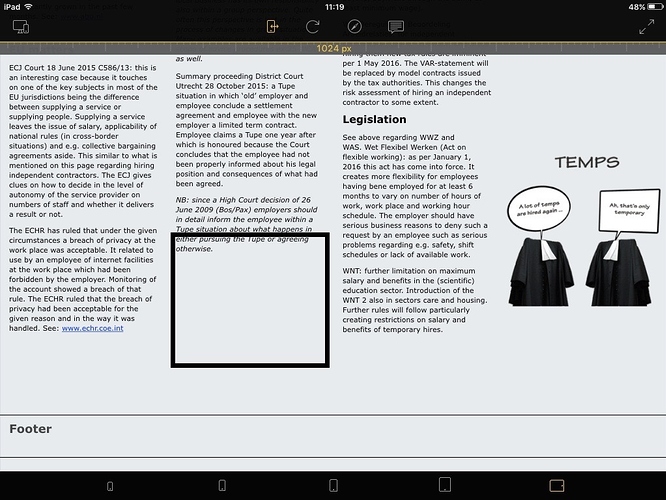
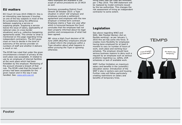
Hi, if I preview a site on my iPad in landscape, the underside is pushed up. In Hype it looks fine. Also in Safari on my Mac it looks good. It doesn’t happen with de portrait version (2 columns) and the Iphone (1 column) versions I made. It only happens with the landscape version on the iPad in Hype reflect and online. I even put an extra blok in to see what happens and it is also pushed up and goes partly over the text unless I give it a lot of extra room above. I had to give the footer some extra room above too. Any suggestions.
Can you share a link?
Hi Daniel, It looks as if the line height is different, but that is done automatically in Hype. If I use another font it changes and i cannot change it manually. The font makes the line height. And it should not look different online.
Hi, I think I found it. The text was copied from Word in Pages and the line height had to be set to ‘minimal’ in stead of ‘rules’. Then copied to Hype you can alter it in any way you like.
Glad you found the issue – copying plain text into Hype is definitely best.


