I’ve got a project with a bunch of one-line text objects that are linked to actions to hide and reveal content.
As I work on the project I have found that without any obvious reason the hot spot (the text box) is no longer at the same location as the text that is displayed - sometimes up to 20 pixels higher – floating invisibly in space instead of being aligned with the text it used to contain. The line setting is Normal and there are no preceding spaces. The offsets are as they should be (50/50) The last time I worked on this file, everything worked great. This time, I was just making minor changes to text items that are totally unrelated to the problematic text items.
It’s like an epidemic and random. Relaunching the app doesn’t help. Has anyone else encountered this?
(BTW, there have been a couple projects over the past few months that would get wonky and I had to rebuild them from scratch. I’ve been trying to figure out what causes the problem.)
I have meticulously checked everything down to the finest detail. I am wondering if anyone else has had this problem – Suddenly random stuff has gone wonky because of some unknown corruption.
I do a ton of hype stuff - using Hype for nearly three years now - but since upgrading to version 3 I’ve had this happen to around one project in twenty. I’ve trashed and reinstalled. Just trying to see if anyone has had this issue and if there is a fix.
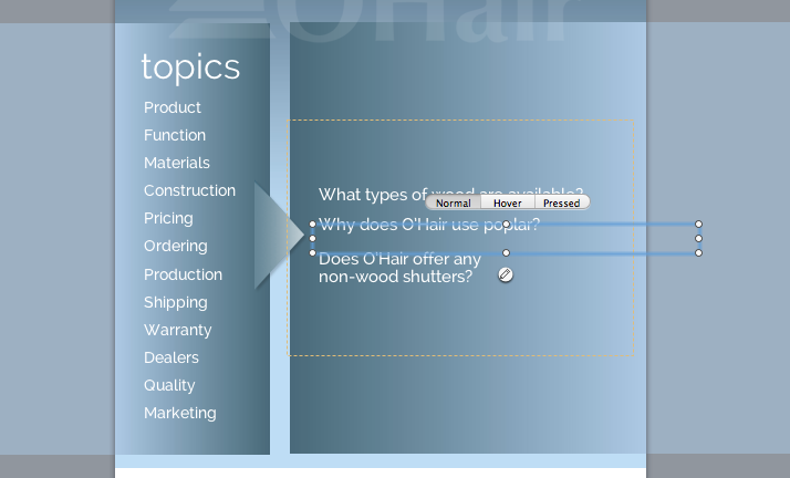
Here’s the file. It is boneheadedly complex - topics / questions / answers controlled by various timelines – very fiddly. There is some sort of bug that is causing the hotspots to shift.
(The gap near the top? That’s another issue I’m trying to sort out.)
Scroll down to the FAQ, select the pricing topic and click on the second question. The hotspot is inexplicably some 30 pixels below the text. I will go in and fix / replace a bunch of items like this and output it, but when I test it, the same thing happens somewhere else. (Click on Shipping and it jumps to the right.) Total whack-a-mole death match 2000.
Hype is not the best choice for this type of content. I wish I had the time to figure out a database solution as opposed to this blunt force thing. I have a one-man department handling all corporate marketing plus hundreds of dealers.
I’m having difficulty figuring out how the questions actually work - based on how I see the document the z-index of other questions would be above what you’d want to hit, and the answer would show up for the wrong one. However, a lot of the time this isn’t the case.
Regardless, in the initial issue of text not aligning with boxes, I’m a little unclear on if I see that problem. Could you list out steps to reproduce that?
Sorry to trouble the J-man with this. It is a bird’s nest.
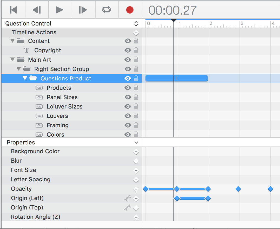
There are some junk timelines in there from earlier stuff. The relevant timelines are:
Question Control – This works with the categories in the left panel, causing groups of questions in the right panel to appear.
Answer Category Control – This works with the right panel, causing controlling the visibility of the answers for each question to appear in the bottom panel.
Answers timeline – This controls the visibilit all answers for each category, grouped at different points in the timeline.
Example: Click on “Product” topic to move the Question Control timeline to 1 second, making the product questions visible. Click on the first question ("…product offerings") to move the Answers timeline to 1 second, making the first answer (the product offerings answer) visible.
The complexity is pretty intense (which is why a database solution would be preferable). Check out the screen shot. This time when I opened the file, two of the three hotspots (the text boxes) were knocked out of position in relation to the buttons.
I’m seeing items layered on top of other items - even if you set the opacity to 0, it will still interfere with the clicks since an item with a higher z-index will get the event. In the above example, it looks like the elements being displayed does not contain the element being selected.
To avoid the z-index issue, you would either need to move items out of the way, use javascript to manually change the display property, or use the upcoming Hype 3.5 which has this feature.
The difference is that it has additional Q&A content for prospective dealers. The version I am working with at present is for consumers, the difference being that I deleted unwanted dealer-oriented content and made no other changes.
Note that the materials category questions work properly in the above linked page.
WIth the screen shot, I opened the Hype project for the June version and made no changes of any sort. When I did a preview the hotspots for the second and third questions were out of place. I went back to Hype, selected the second question and took the screen shot. I think that there is so much going on that it may have exceeded the capacity of some register or something.
I have also noticed that after spending several hours working on various Hype projects, shutting down Hype can freeze everything except for mouse tracking for several minutes, with a ghost of a closed Hype window being visible. I’m wondering if there could be a memory leak that may be related to both issues.
Weird – do you have a copy/time machine backup of the original .hype document from that export (like one before it was opened/upgraded in 3.0)? I’d love to see that and figure out the difference.
The main difference I see is that in the older document the Question Control timeline animations for the groups have an additional animation that moves the group’s left position to be out of the way. This is essential for the ordering.
Old (and would behave correctly from my perspective):
Thanks. I’m still curious about how opening and previewing the original document would allow the text to remain in place while the box that contains it is bumped out of position. Probably best to leave that question for later.
1 - Single text element with ALL answers. Which moves up and down a timeline
This means you need One Timeline for the Answers.
2, Questions outside of viewport. 1 Timeline to move them in and out.
This means you need One Timeline for the Questions.
3, Limited layers, important ones at top.
So you now only Have one Text Item and two extra Timelines.
( Also make sure you edit buttons Base position in the main Timeline only. Or you will get them jumping all over the place as I found with the Topic buttons. )