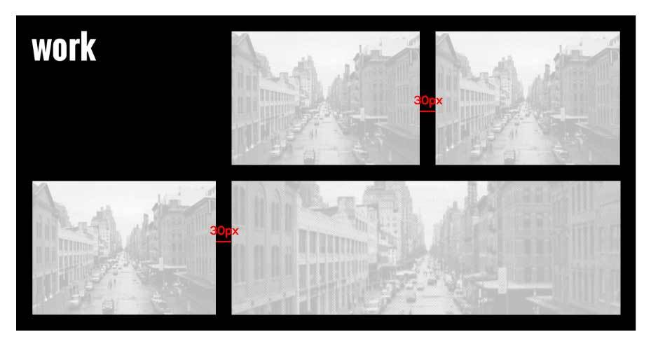
I am trying to do a little portfolio segment for a website I am building with Hype (going pretty good so far!). But I am having a problem with images that are next to each other. They should always have a 30px margin between them, but when I am trying to make them responsive they just stretch, and I don’t know how to keep the distance between them.
This is similar to another question I asked here before, but I cant find the right solution to make this work. I attached my current file (well, the part of it that counts), and I am grateful for any help!
You mention “responsive” & “stretch” in the same sentence; but in your demo project there is not another layout which would be required for a responsive set-up… so I am assuming you are referring to just using a flexible layout - not responsive. I would think that if we are talking flexible You would want to keep the distance proportionate - i.e. as the overall page size shrunk or expanded the actual pixel distance between images would change but still be the same percentage distance and so maintain the same overall look of the layout.
If You do wish the pixel distance to be maintained at at (roughly 30 pixels) You will need to consider adding responsive layouts.
Anyway, the approach I’ve taken for this demo is flexible only, following along with (most of) your stated parameters above and your demo project set-up.
You are right, what I am describing is a flexible Layout ( I will add a mobile layout later). Thank you for your solution, but what I mean ist that the margin between the pictures stays the same , regardless of the screen getting larger or smaller.
I attached two screens which hopefully make clearer what I am trying to do. One is for “smaller” screens where it looks fine right now as this the size I made it in, then one where the Images stretch across the screen where I want to keep the margins as on the “smaller” screen.
this is not built in … as every hype elements position is basically absolute.
there is some flexibilty with responsive settings and layouts but it’s nothing in common with css position static.
though you can add several layouts for many sizes to get there … i guess
other possibilities to achieve your aim:
some css-hack which will probably not match with hypes WYSIWYG-approach
a js-solution using hypes own API. which will probably be a clean solution
TIPP: if you enjoy working with Hype, try to work with its strength and do not try to use hacks to achieve something that is not supported.
Thank guys, I will take a look at this. I already knew it but I did not see how to best adapt it to my needs (still pretty new at doing responsive stuff in hype.
This particular file is a great starting point for a project because it works in Safari Responsive Design Mode in all layouts and all orientations. Not an easy thing to do.
Great for building confidence and testing modifications.

 but you must admit that it’s somehow confusing