I have designed and checked the flexible layout settings for all of my images on my website. I have posted on a job site and want to make sure it will view correctly on web browsers, smart phones and tablets. Can someone look at it and see if my images and text load and view correctly: I have checked the previews on the phone through the Hype Reflect app, Safari and Firefox and they view correctly, but for some reason, on my server it is not through filezilla.
I gave your site a test on Chrome & Safari (Desktop) and Android - there was no point to firing up the iPhone or iPad because the first three displayed significant issues as indicated by the screen shots below which were taken from Safari Desktop but are representative of the others. The elements were all over the place depending on how I adjusted the browser window.
Qualified Statement: I think the odds would be good.
Posting your Hype document here on the Forum (or the portion exhibiting the problem) would allow us to have a look to see if there is a possible fix - or to suggest an alternate approach. (I personally will not have time to give it more than a quick run through to see if there isn't some basic adjustment to improve things.)
There are some sites like browserstack.com that allow you to do basic previews on different devices/browsers. Animation doesn’t always come through great, but these are a great way to test general layout without owning a lot or maintaining several VMs.
Here’s the general idea - You will need to fine tune it - or make other adjustments to suite your needs. I’ve only had time to look at the “home_scene” but this should at least point You in the right direction for further investigation (e.g. do a Forum search for “flexible”; also Hype on-line documentation Flexible Layout).
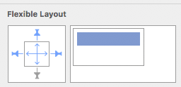
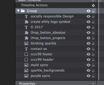
Fig. 1) Grouped all the elements in the Scene (“Timeline” layers).
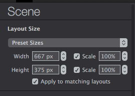
Fig. 2) Set the Scene to allow scaling (“Scene Inspector”).
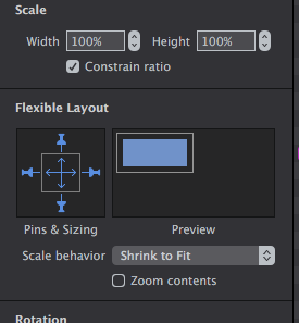
Fig. 3) Set the “Flexible Layout” parameters (“Metrics Inspector”).
You group them so they are all acted on as a single unit. The best way to see the effects of grouping the elements is to ungroup them (keeping everything else the same) and see the difference.
There is more to “Flexible Layout” than what is shown in my demo. @michelangelo is a master of using this Hype feature. Check out his HypeDocks site - such as the “Fluid Columns Kit” - for excellent examples on this and other topics… a great learning resource!
I have done a bit of practicing with “Flexible Layouts” to truly understand its capabilities, and know how to get the effect I want (or know if the effect is possible) without a lot of trial and error when the time comes to use it in an actual project.
I need you to weigh in on this nightmare I am facing…
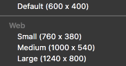
My pages are cut off at the bottom and I have no idea why. I don’t use animations at all in hype so it is just a page issue. My page width is 1240 x 1200 although I would like it longer. I can see no area anywhere on your site that speaks to real life page sizes. Jonathan, am I missing something here…how can there be a preset for 600 x 400 as a website.
I put in 1240 x 1600 and proceed to build my stuff into place. Everything looks great and when I preview…most of my pages are cut off at the bottom and I cannot see the footer etc. So please if you will, give me some direction as to what or where to go with this. If you can remember years ago, you and I spoke via phone and I was one of your first customers. From then until now I have not successfully completed a single site mostly due to very slow response to help requests from the forum. But now I see Hype Pro which I am using and I want to give it a try.
Not sure why you're using Hype in the first place as this is mainly what it's used for. Hype is for building animated HTML5 (granted you can just use it for static content) but mostly it is to help animate DOM content. I personally wouldn't use it for building a website especially if it's only HTML5.
This is not a preset for Web but the default size for animations when first opened. There are 3 "Web" presets but you have to understand these are not for "pages" but for animations at that size. Browsers almost inevitably have continually changing viewport sizes which is why there are many topics and issues relating to this here.
It's great that you've been a customer for all this time and I'm sure the team at tumult appreciate this. But, as Jim mentioned above. The forum is a place where like minded users offer help and guidance to each other and not a paid support service and even though the guys at Tumult often post here it's again not an invitation to have tailored service by them. They have a means in which to "report an issue" inside of Hype if you indeed have an issue with Hype and the way it's working.
I fear though that some of your posts are down to not completely understanding the software. I don't mean to be blunt but that's only my opinion.
Also, as mentioned previously. There could be many reasons why your document is not acting how you think it should be acting SO posting a document or even a website that you have with the issues and we can better tell what it is that is going on and offer guidance or solutions.
Hi Michaelangelo. Jim Scott thought you might be able to help me with flexible layoust. I am attaching two screen shots. The first one is what my home page looks like in Safari on my phone and the second is what it looks like in hype. It looks like it is compressed vertically, but I cannot find settings that would scale it in proportion. It might be that my browser is not refreshing even though I cleared all history and shut down the phone. Do you have any suggestions?
Here’s a template I posted a while back with a similar structure for multiple layouts: Share your Templates
I think the key thing that will help you here is structuring your content into groups and setting specific pinning properties on those groups. The specific issue above looks like you have flexible layout set on the height dimension of your document, so things are getting squished up. I recommend letting the height flow naturally, but being strategic about how your elements fit the width of the available space.
Hi Daniel,
The template works for the phone. but not for the web. I just need all the elements to scale as the browser window gets smaller. Could you send a sample of the web only. I tried Scotts suggestion of pinning all and grouping, but that didn’t work.
Here's how it looks on the web: Tumult Hype Professional -- What do you mean that it doesn't work?
This might help?
I don't think having everything get smaller as the viewport gets smaller is a good way to go about this, but you can do this by using the above technique.
I can not identify the problem, but it probably depends on the "flexible layout" panel settings and the maximum width of the object (or group that contains other objects).
Try to leave more space between the elements and not use the "scale" option for the toolbar.
I been working on my site since February, and have tried all different combinations of grouping, symbols, layouts, and scaling. I have tried pinning top and sides. I have tried pinning top and left, I have tried pinning all and scaling all and get different results on my browser for each scene, even though the hype document is consistent.
This morning, I plugged in my phone and tested it on the safari developer tab. I am grouping all my elements including symbols and using the width of my iPhone 6 portrait, iPhone 6 landscape and computer layout as the break point. The scale setting is set to expand to fit and it is not scaling for the different size phones. Can someone who really knows hype help me. Here are the screen shots.
