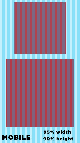
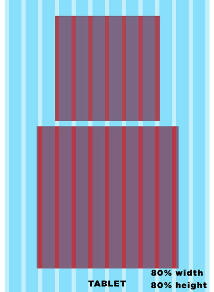
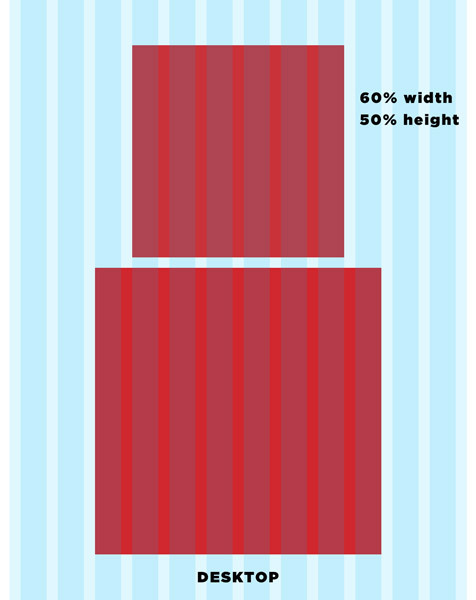
Hey guys, super basic question but I’ve never really done websites with Hype, only ads and I’m making kind of an interactive experiment I want to be able to place it on a site and have it repsonsive. It’s only got 2 main items, the bottom box is the interactive grid, the top box is an output grid with score/information. But I want this layout to work slightly different on mobile. I want it to scale slightly different so that the bottom box stays bigger but the top box slightly smaller.
So a few basic questions
How do you make a basic layout for hype so you can control how it looks on Desktop, Tablet and Mobile(ios and android)?
Can you narrow down all types of outputs into those 3 so that for example all android devices make hype launch the mobile page layout for example and ipads launch the tablet layout? Is there a button for that in hype or does it do it by default?
Do you have any example files of clean grid hype files with different versions for different devices I can take a look at?
Introducing: “Responsive Widget” with persistent symbol
Widget with fluid size through an extra CSS.
with just one symbol you can change the size in all layouts
.fit_symbol { /* fit widget size (start from the smallest layout)  */
height: inherit !important;/* provides the coverage of the box */
width: 100% !important;
padding: 0!important;
margin-right: auto !important;
margin-left: auto !important;
}
hey @michelangelo awesome! But no I’ve never used widgets before. Could you explain with this symbol should I just leave it in the symbol and all items in the symbol i add will responsively scale with it?
HI @Luckyde this method is good only for widgets, Text boxes and any kind of element with fluid width.
This trick allows you to change the size and the ratio of the symbol.
If you are using multiple elements in groups must use the class for all objects.

 to the widget