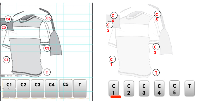
On the attached image I have the layout we’ve been working on on the left and on the right the export as seen in Chrome. What I can’t seem to work out is how/why some of the elements are shifting in the manner they are, especially the buttons where the red ‘indicator’ is positioned correctly but the button itself has narrowed and shortened.
@elevenvelo i had similar problem too.
crome seems to have bigger font size or shows bigger than hype.
making the font size smaller worked for me.
but i suggest not to use textured button.
try to use text and textured button separately.
this is all i can say.
hope this helped.
I’ve ended up doing the elements at png images files. They are so small it’s not an issue and they are a lot safer in terms of making sure they appear like they should.
For others hitting this issue: Some browsers show fonts at a larger width than Webkit’s rendering engine (which Hype uses). To resolve this, increase the width of your text boxes to avoid any text wrapping.