I am really struggling with the best layouts, particularly with the desktop version of a the site.
Is there a recommended layout setup that will cover the most common devices. I am trying Landscape iPhone, iPad and Destop. I am developing a site on a 2009 MacBook pro and the desktop version just does not ‘always’ work/format correctly. Is just not easy!
iPhone 5S landscape width is 568px. iPad landscape width is 1024. Lots of sites seem to shoot for 960px wide for desktop. This would account for iPad and desktop. One other layout for landscape iPhone - 568px would still fit into iPhone 6 and 6+.
I’ve also found that adjusting the breakpoints also helps. Adding a breakpoint higher than the layout width smooths the transition between widths.
Experiencing the above mentioned issues, finding the best layout for most common devices. It’s getting frustrating
Is there someone that could help me with a ’ template Hype file’? (with the layouts and breaking points which will fit on most devices (from a 27 inch imac, regular pc displays, Ipad (portrait.landscape), iphone (portrait/landscape)
I had to experiment myself with correct breakpoints for all my devices. I have an iMac27", desktop pc, ipad and iphone 5. The website I have created after days of trying out different breakpoints seems to display fine on all devices. I didn’t use different breakpoints for iMac and desktop pc, but instead pinned elements, objects and text so that they would display nicely with different monitor or browser window sizes.
Have a look at the website and resize the browser window from full screen to very narrow, check breaking points and correct display of contents. If this is what you were looking for and the breaking points suit your needs, I could prepare a hype template for you if you wish.
Breaking points are optimized for desktop, iPad 2 and iPhone 5.
Additional note:
Probably you know already, to preview the layout on the iPad and iPhone, you will need to install Hype Reflect on your mobile devices.
Your site looks very good on all devices, compliments. Im am trying to make a sort of presentation which comes along with a Pubquiz. The Hype document is support to the asked questions by the quizmaster (with images, videos).
But they need to be projected either on a beamer on a big screen, but also on an ipad if you want to play with your friends at home for example. So I don’t need scrolling in the document, each device needs ‘it’s own’ full screen setting. I embedded a video in one of the slides yesterday and when I viewed it on my 15” Macbook Pro, it looked ok, but when I wanted to view the video fullscreen, Hype also reacted to a different breakpoint, so I got a different bad layout (and video stays small).
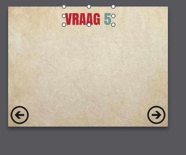
See attached pictures for the global idea (‘Vraag’ is dutch for ‘question’ btw :-))
Could you attach your Hype document so I can take a look at your setup? (you can zip it up and drag it into a forum post).
It sounds like you will want a couple of layouts (likely iPhone, iPad, and Desktop) and then you will want to use flexible layout pins and sizes to adjust to sizes in-between these layouts. http://tumult.com/hype/documentation/3.0/#flexible-layout
Attached you find two slides from my Hype presentation.
Yes I want my design to fit on most common devices (iphone/Ipad and bigger screens (like a 1080p television or projected with a beamer). Can’t seem to figure out what are the best sizes to use (with breakpoints).
Even an iPhone layout differs I experienced… (iphone 4/5/6 etc).
Hope you can help me/get me in the right direction.
I apologize for the late reply. I was busy working on a new project and this somehow slipped through the cracks.
I think you are actually pretty close. A few tricky cases:
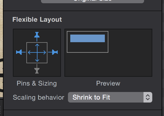
Desktop:
Flexible layout is definitely the key to making your design look good on multiple desktop resolutions. You still may need to add a layout or two for very small desktops (MacBook Air) and very large desktops (24 inch) iMacs. One key thing I noticed in your document is that you need to make use of flexible width and height. For example I recommend these settings for your Beethoven image:
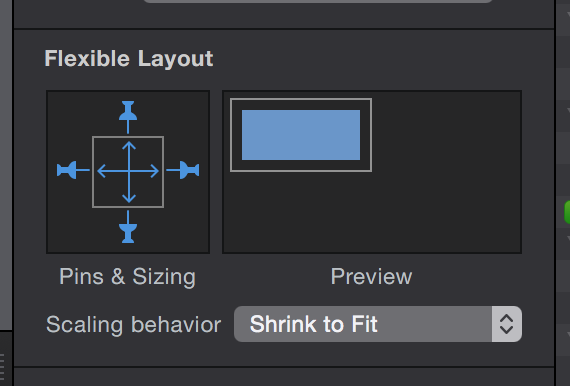
Mobile
For iPhone 5 vs 6 vs 6+ you can have a separate layout for each if you need to. Each device has a different width (320, 375, and 414 respectively). Differentiating between the 4 and 5 is more difficult because they have the same width. I would attempt to use flexible layout. Something like this on the Beethoven image looked pretty good to me: