Hi! I’m trying to apply a shadow on a vector image to animate it after, but I would like that the shadow fits the borders of my title, is there a way to do it? My image is actually in PNG with a transparent background.
It’s not possible in Hype, but you can still do it using CSS:
<style>
.shadowfilter {
-webkit-filter: drop-shadow(12px 12px 7px rgba(0,0,0,0.5));
filter: url(shadow.svg#drop-shadow);
}
</style>
Oh thanks a lot, I’m really pleased to know this new trick. But would it be possible to animate it, like make it bigger and bigger, add blurred and make it disappear afterward?!
Maybe you could duplicate it and then apply the filters in Hype (note they are not supported fully)
And animate the copy.
btw, the filters I’ve applied are Brightness->0%, Contrast->0.0 and Blur->6.4px
Of course you can adjust to whatever you need
Super, great idea! Thanks a lot!!
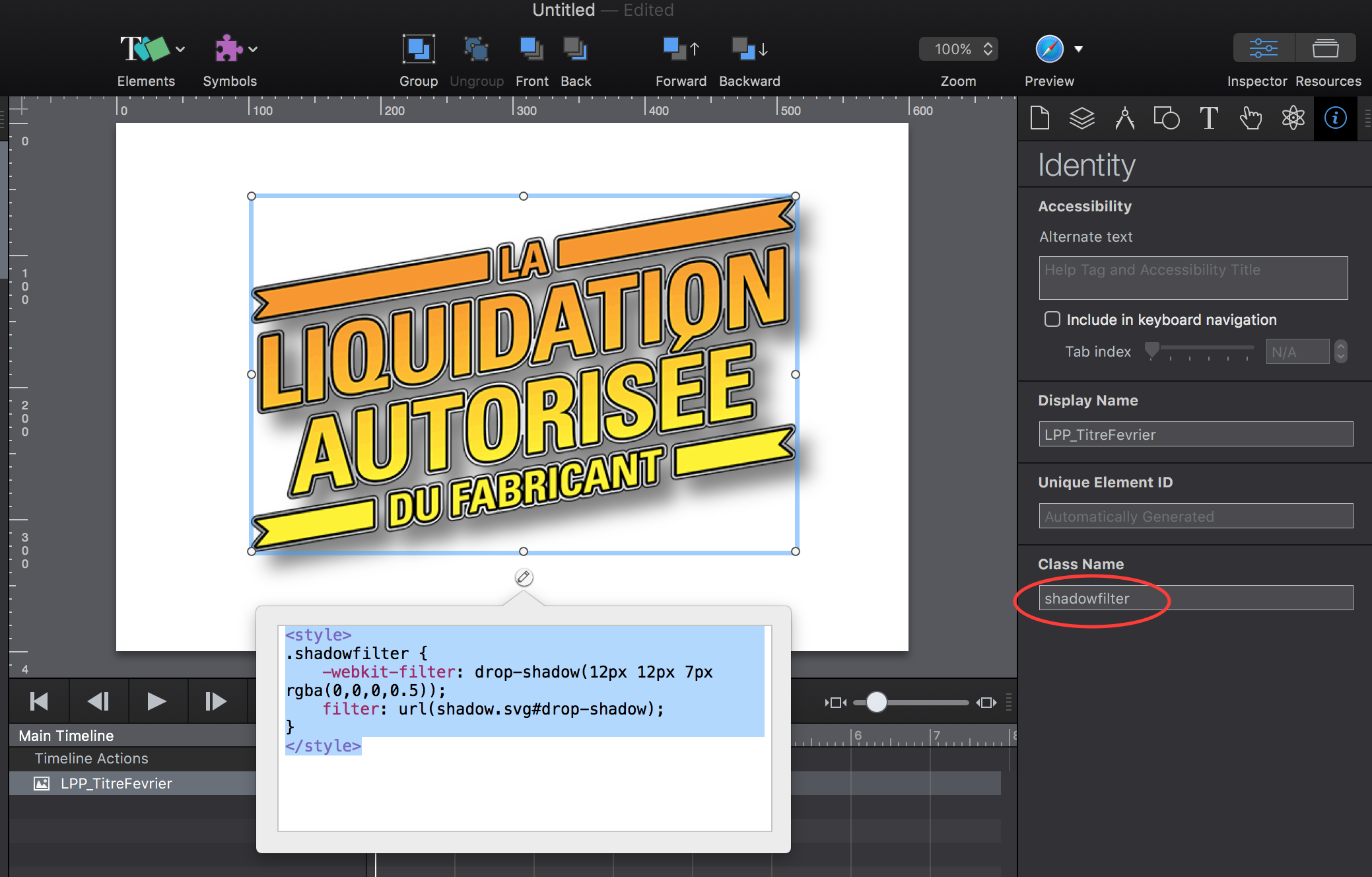
I’ve copy and paste your code in the intern HTML code of my element but I don’t see the drop-shadow under my title even if I previews in Hype, Chrome or Firefox
I have never thought of it and never applied a CSS class to Hype, now I know How and I’m very happy, thanks a lot!