Thanks Daniel!
I tried that but, it did not does not work… It does keep the animation 600px tall but cuts off all the animation if scaled down. - Not showing the content to right. My animation is 1130px wide and 600px tall - so when viewed on mobile it shows only the first 300px.
I really don’t want to have to build responsive layouts each time. Hype seems awesome but, I think there should be an easy way to embed in responsive Wordpress themes. Any tutorials on that?
What viewport should be selected? Document Width - Device Width?
Thanks!!
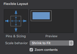
I think what I did to resolve at least part of your issue was to group everything as one group, then to that group use the settings below. This I believe is what allowed me to have it scale like a single image.
Thanks for the ideas but I still am having no luck?? So my contain is resizing using the code. Now I see in Hype It wont let me select Shrink to Fit?? Is there some other setting that needs done to get that to work?
Please Hype build a “Export To Wordpress Responsive” into the software!
Thanks!
please create a hypefile with width and height responsive.
provide the ration that should be used.
embed it in your wordpresspage.
DON’T add my provided script
Here is the link with your code it does rescale. Without nothing will show up. I think the problem now is it wont let me select ‘Shrink to Fit’. Any ideas how to get it so I can select Shrink to fit?
I have tried everything it wont let me select anything there on that Flexible Layout - Scale Behavior. I have it all grouped. I have 100% selected … It wont let me? Is something else stopping that?
It’s nice to see workarounds for this issue, but I thought I would put together a video to help demonstrate the best practices / ‘no code’ method to create a responsive Tumult Hype document for Wordpress. This takes you from a non-responsive document all the way to embedding a Wordpress document on a page: