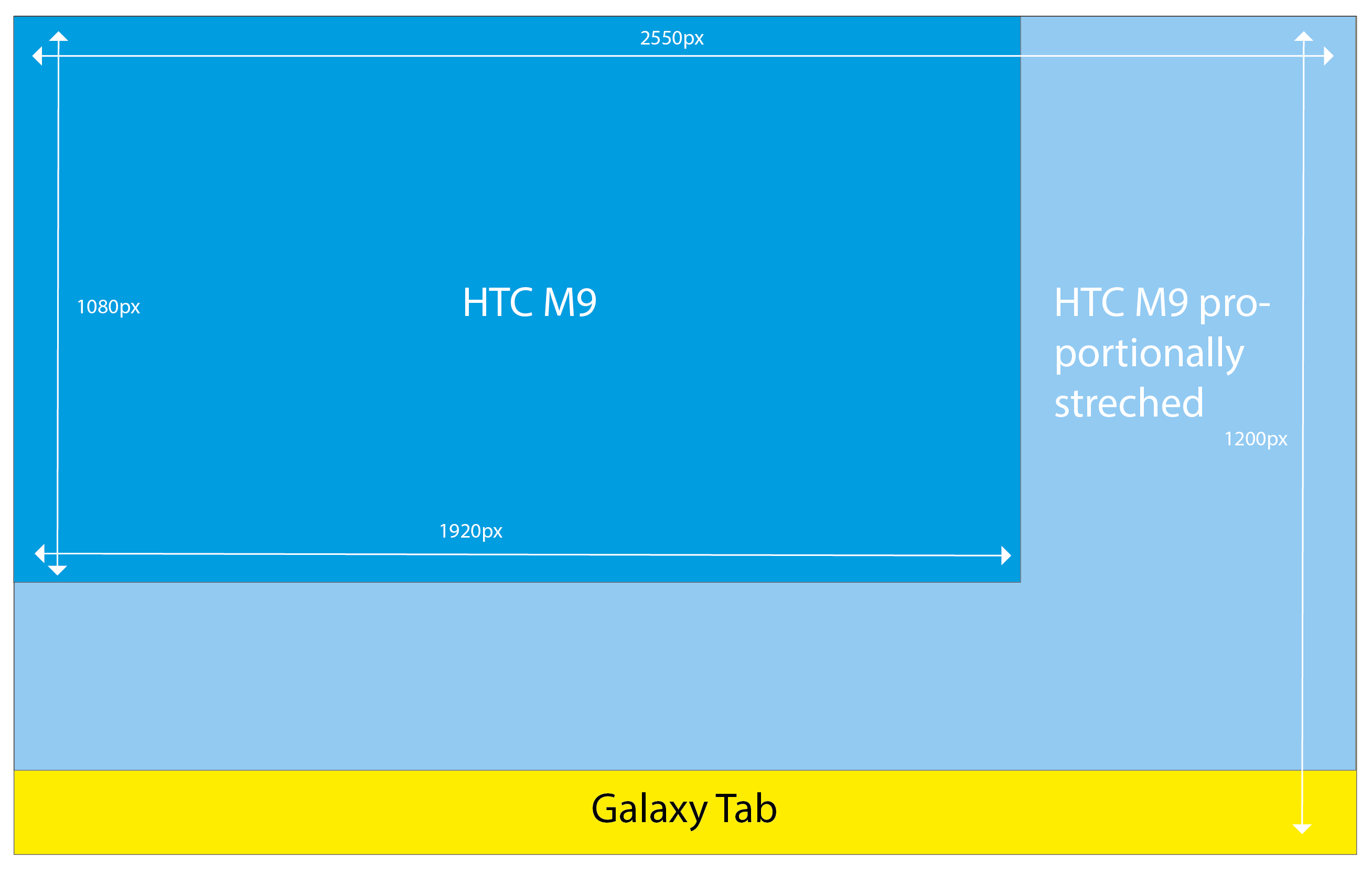
I have a beginner question about responsive scaling. I want to make an android app but i strugle with the responsive settings in the hype pro 3 software. If possible i want to let it scale automaticly without set any breakpoints. My devices are a HTC M9 and a Galaxy Tab. My problem is that my animation scales in the width, but at the bottom of my Tablet i get an empty bar (yellow visualized below) because those two devices have a diffrent aspect ratio. To clearify this i have made this little chart.
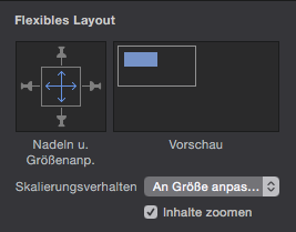
And these are my settings for most objects. Some other objects i have pinned:
How can i prevent this? Correct me if im wrong, but if i want to scale proportionally, i have to choose either the scale to with OR to height. Something i have not found yet is, an option to set a seperate scaling for the background (just black) to scale in width AND height. I have also set the viewpoint initial scale 1.
Im am no coder and sorry for my english. I appreciate your answers!
Think of the pins as pins in a cloth. No matter how you scale, if an element is pinned the top and it is placed at the the top, it will keep that position across the different sizes.
You may want to pin in all four directions as well.
I created a somewhat tutorial document for using responsive design in Hype.
Also. If you want the entire document to expand, this has to be done in the Scene tab.
Thanks, but i kinda know how pinning works, because in Adobe Muse and Adobe edge Animate its the same.
May i better ask;
How can i ONLY scale the Backgroundfill unproportionally (because its only a color)
Is it even possible to get a satisfiable outcome across all devices with pinning and resize options, or is working with breakpoints a better workaround? (its mainly for an Android app for Cats)
Is it even possible to get a satisfiable outcome across all devices with pinning and resize options, or is working with breakpoints a better workaround? (its mainly for an Android app for Cats)
It's almost impossible to make your screen fit with all Android screen size. I was struggling with this too with our first project, we are doing visual novel, as long the important part is not above the fold we are OK with it, and the client didn't make a fuzz about it too.
We ended up make the screen 100% width, making breakpoints take too many work